
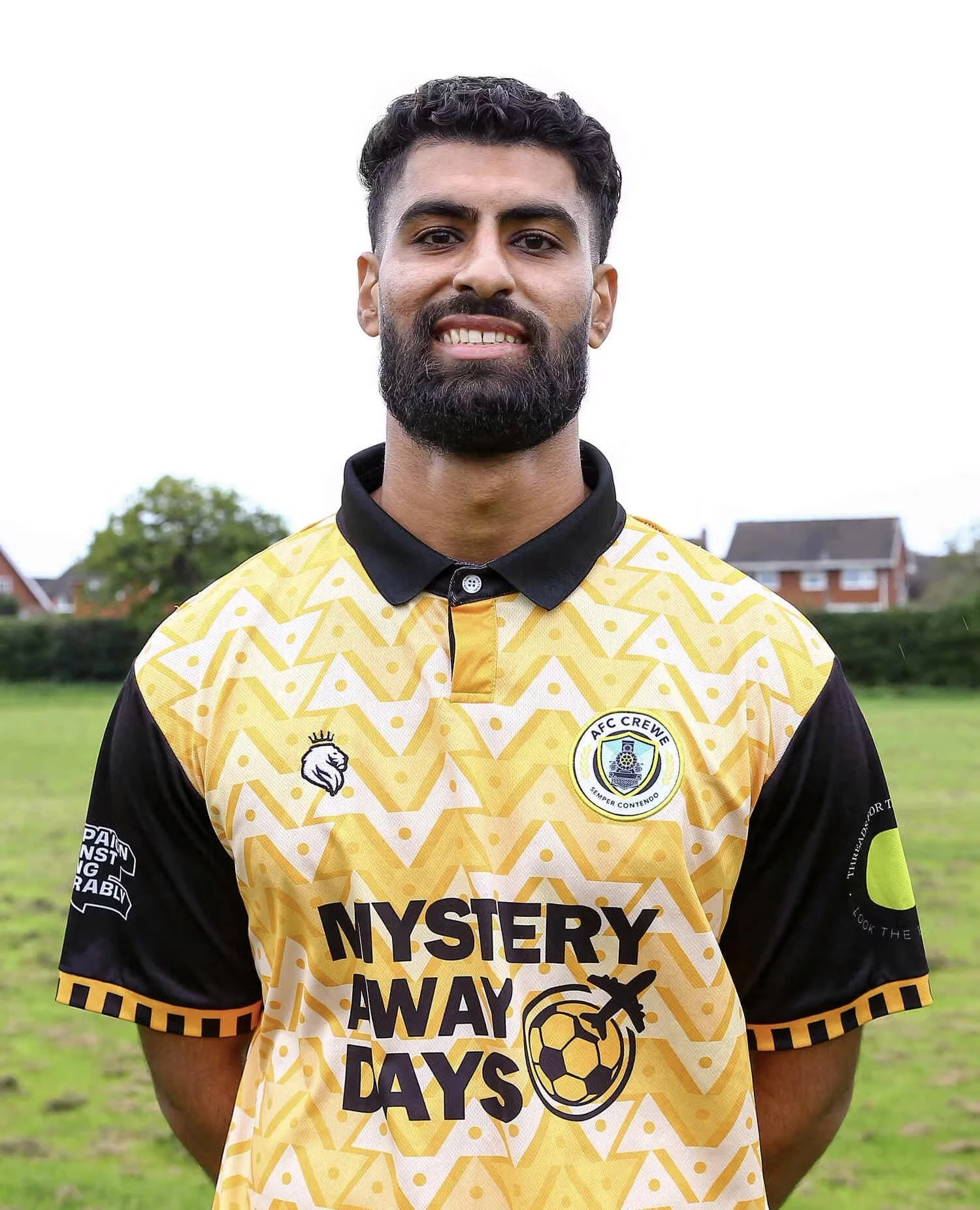
AFC CREWE
Initial Concept Render
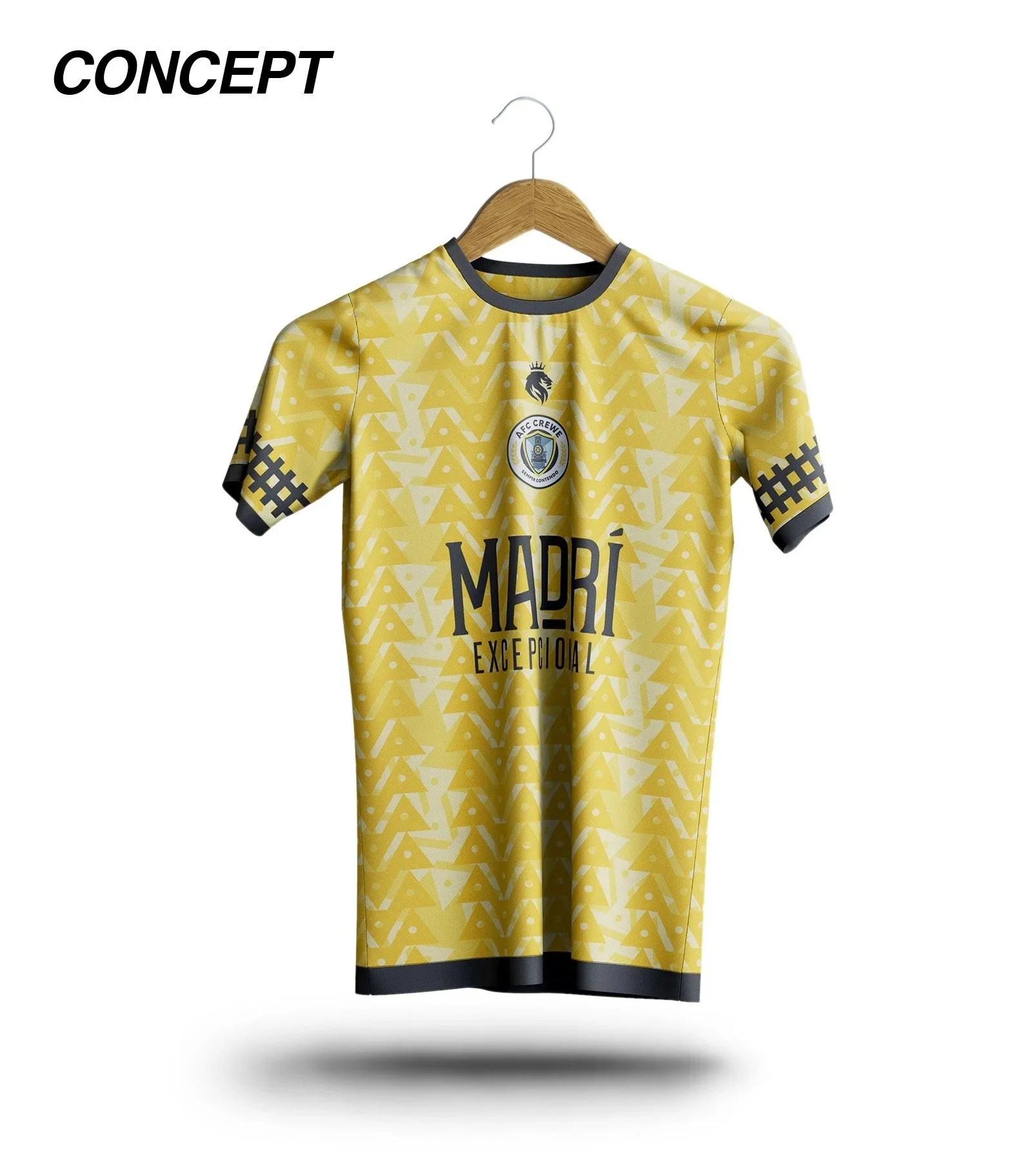
AFC Crewe Home Kit 23/25, design by Hope+Glory & House Of Portway. Partner work by Nabighah.
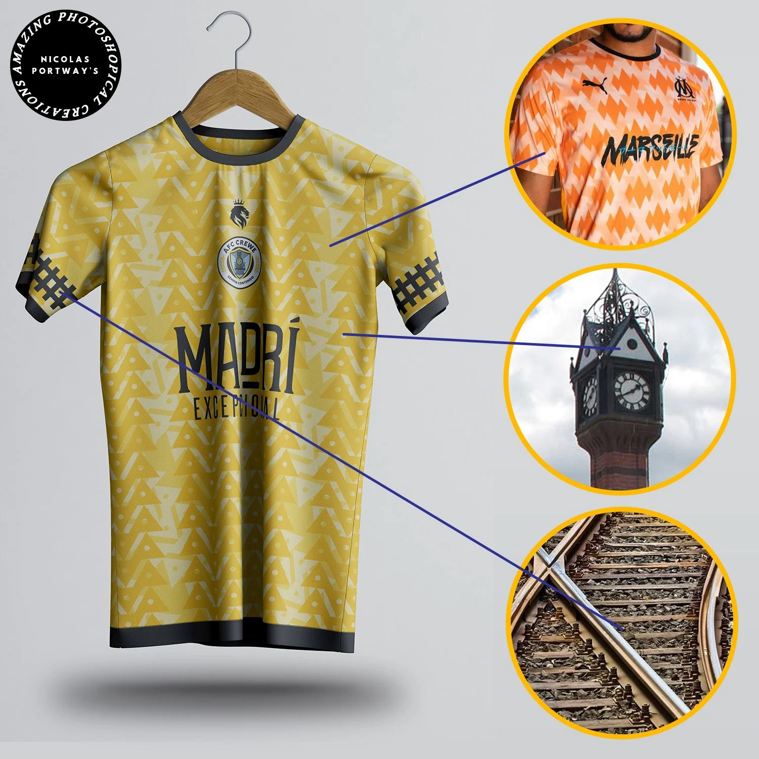
“The home kit is based on a concept I made for the club. The triangle pattern originates from the clock tower in Queen’s Park, Crewe. Architecture is a very underrated source of kit inspiration and I think adidas and Nike should take this pathway more when creating designs. The triangle repeats three times to create a distinctive look. The triangles question you, intrigues you.”
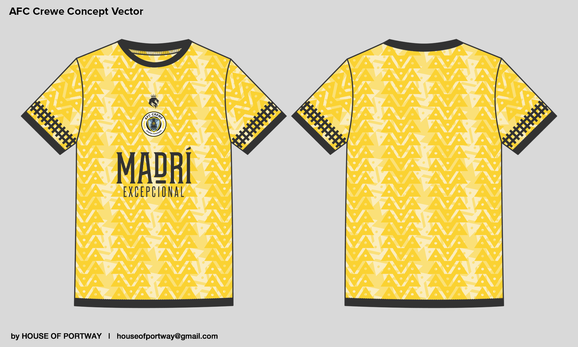
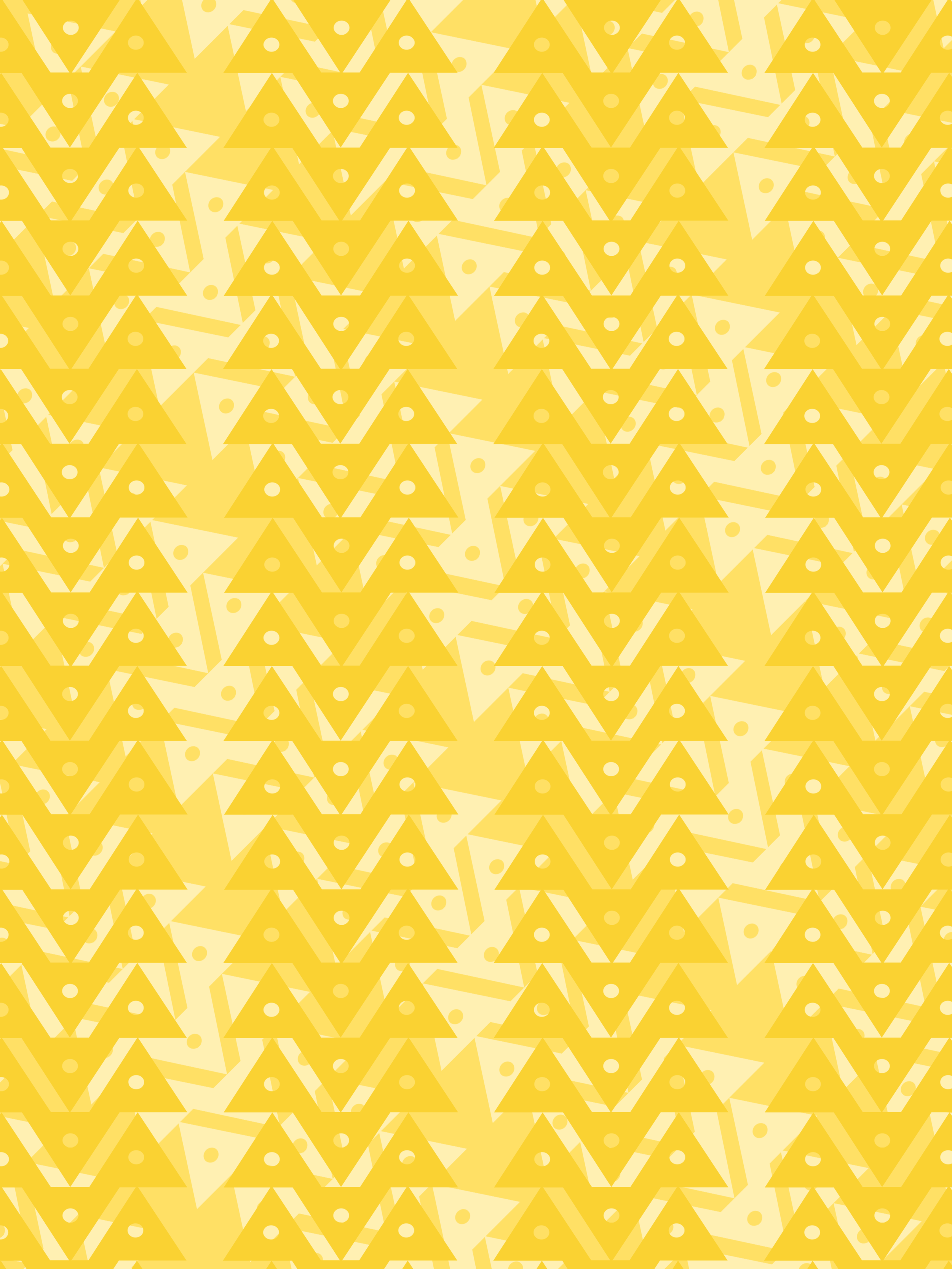
“Originally, my pattern repeated in 4 bands to create triangles within the blank space between the bands. The lighter version of the pattern repeated under it serves take over any extra blank space while also introducing two more dimensions of triangles. Creating this extra layer was important as it essentially introduced a fourth colour to the design, with the black bringing out the yellows and the white contrasting back onto with the black. Balance. This is an influence from Piero Gratton - one of my design idols and an all time great. The final pattern used by H+G is more of a repeating pattern with the triangles varying in opacity.
Crewe was built on its train links, and with the club being nicknamed “the Railboys” I had to include a reference to this. You don’t usually see any patterns going across a sleeve so of course I had to break this rule. The black tracks going across the sleeves were made yellow and subtle to accommodate the smart black sleeves on the final design.
In my sketches the tracks were first across the neck - like a chain or necklace. I think this was because I was drawing at a time where the trailer for Black Panther 2 was being shown in before cinema screenings everywhere. I put the neck tracks around the 3D model and honestly it looked terrible. This is why I don’t release my sketches.”