
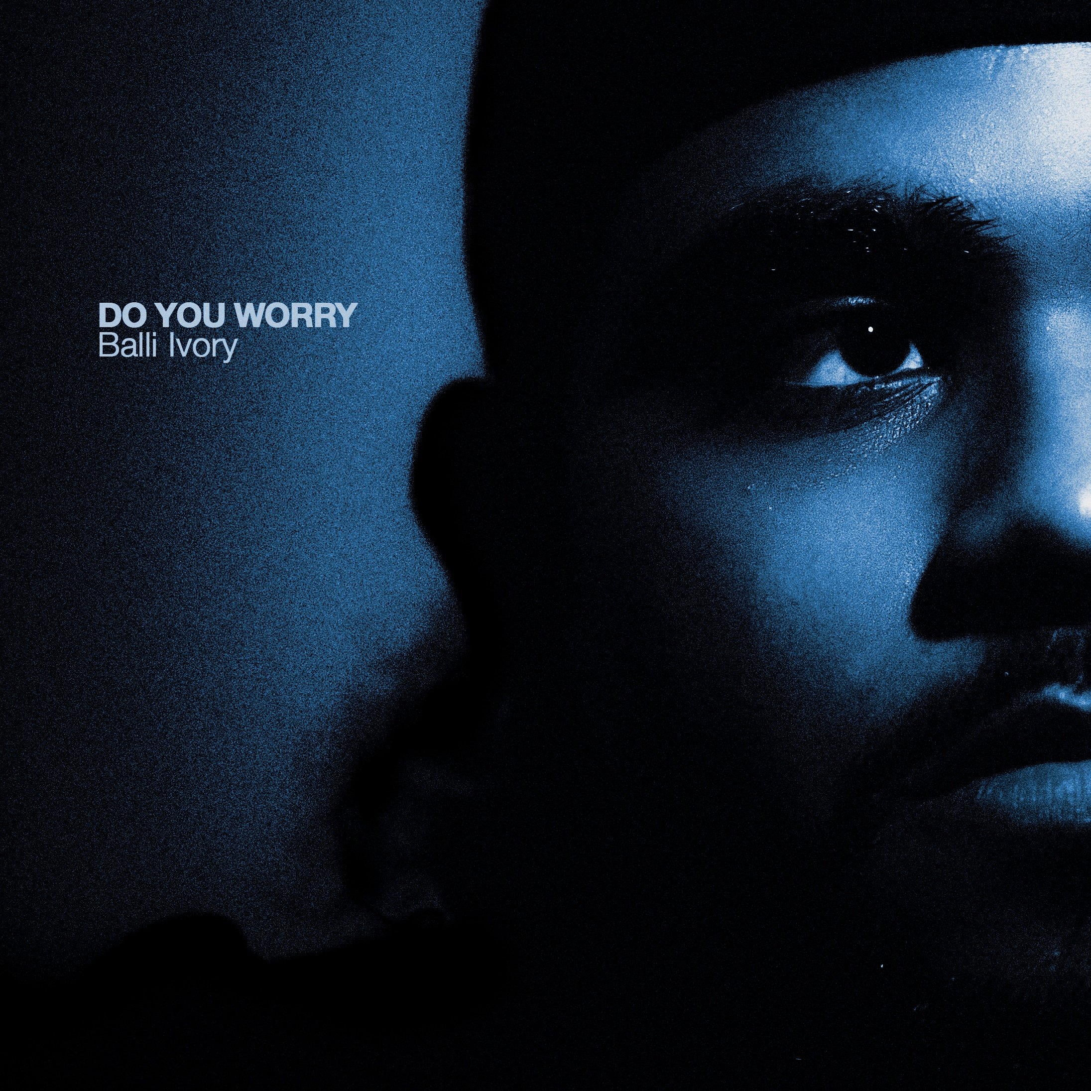
DO YOU WORRY?
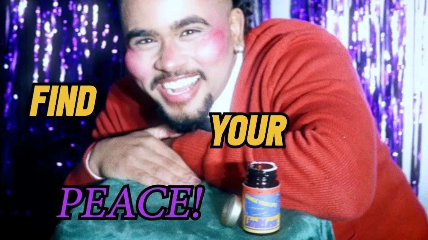
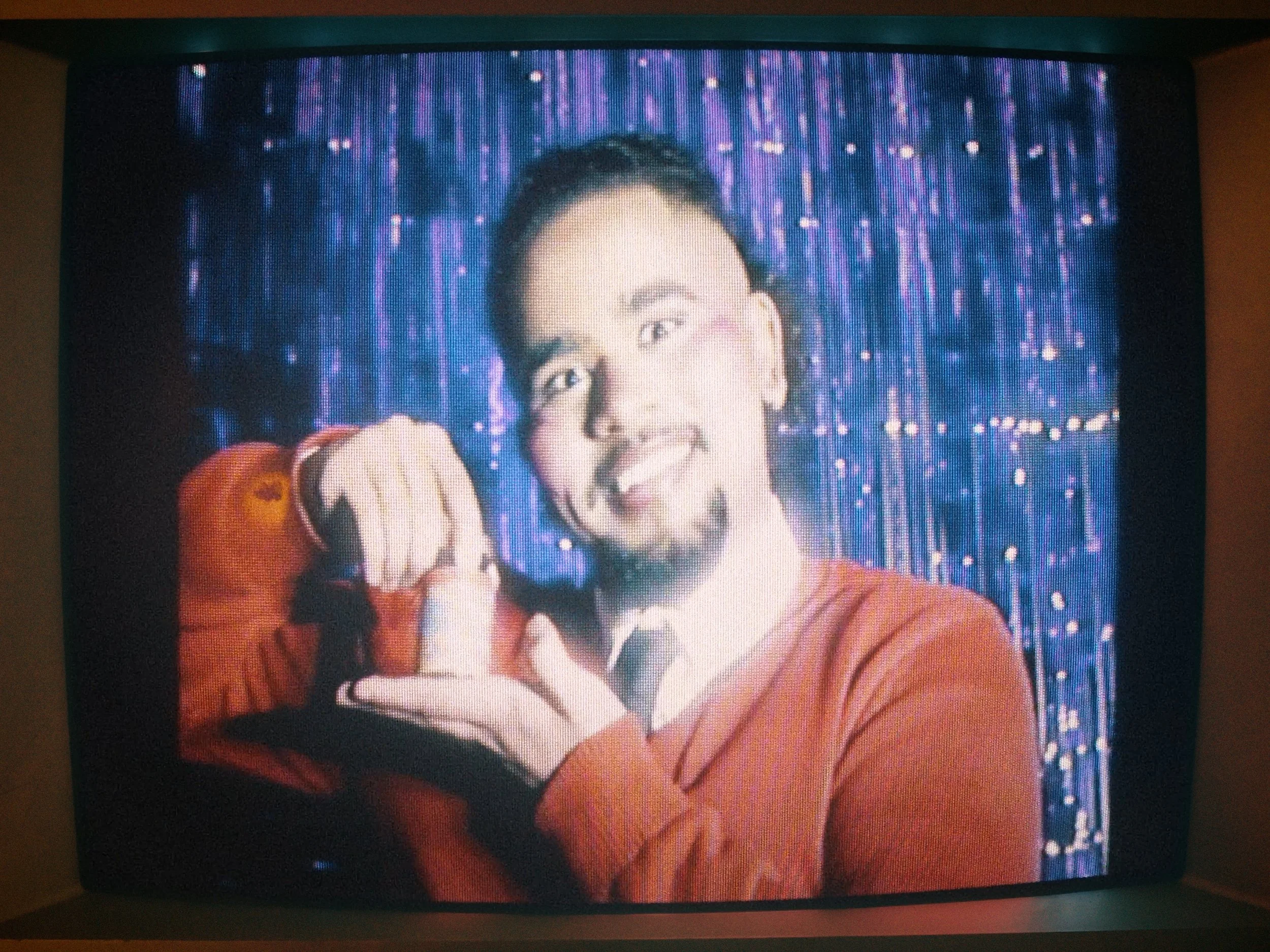
Still from “Do You Worry?” campaign
Is there a right way to promote a release? When Balli Ivory approached us to promote his single “Do You Worry?”, we immediately established our foundation; mood, key elements, palette, and overall tone. Our objective was to create a memorable and distinctive campaign for Balli’s core audience. What we struggled with was creating something visually unique on a shoestring budget. To maximise what we could do, we focused on developing our concepts instead of reducing our ambition, with the goal of having the creativity of the concepts carry the campaign.
This project consisted of three separate shoot days and modules: a cover shoot & promotional imagery, a parody advert shoot, and a main campaign shoot. Each module was designed to explore a singular concept, allowing us to test how far we could push bold, unconventional ideas while still maintaining a visual balance.
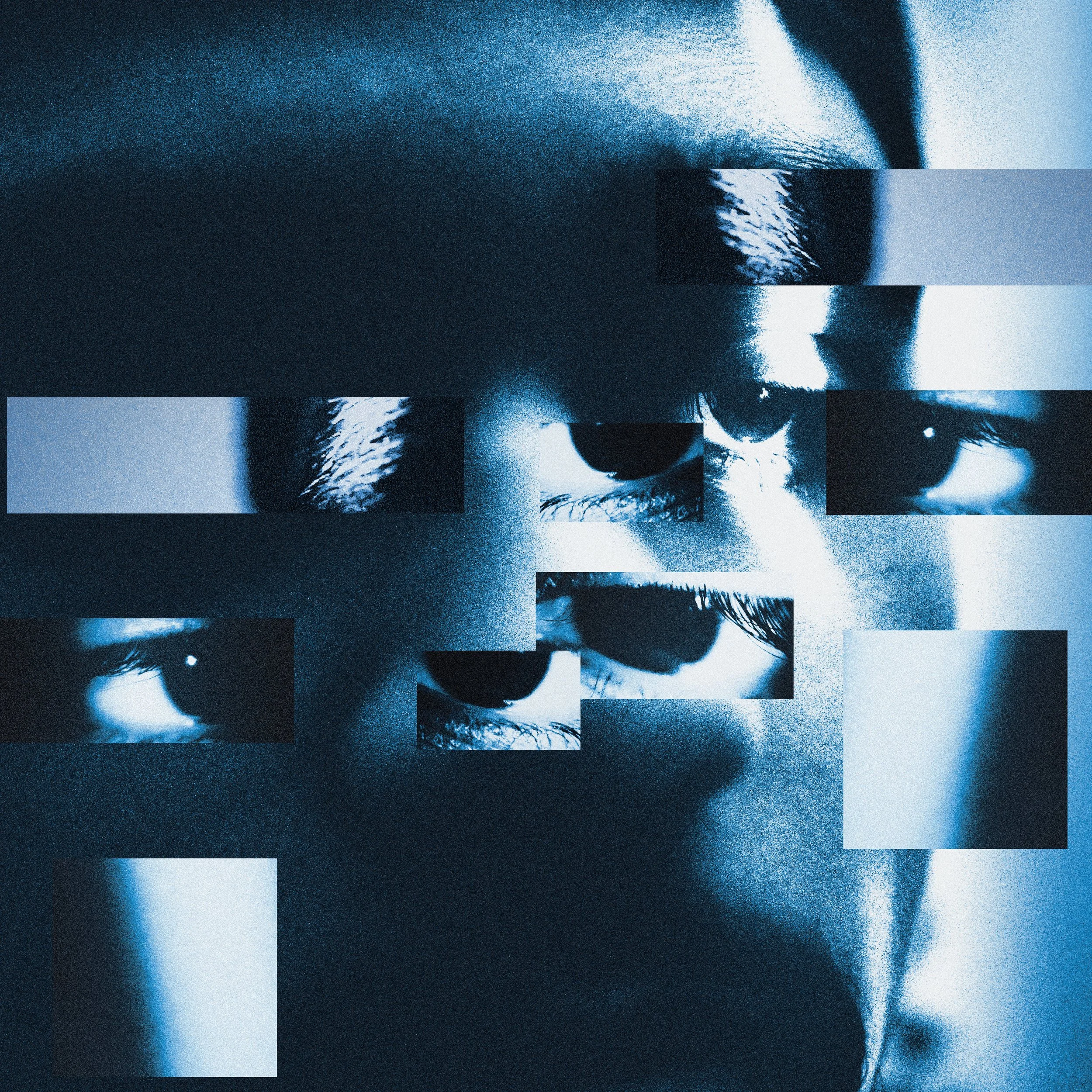
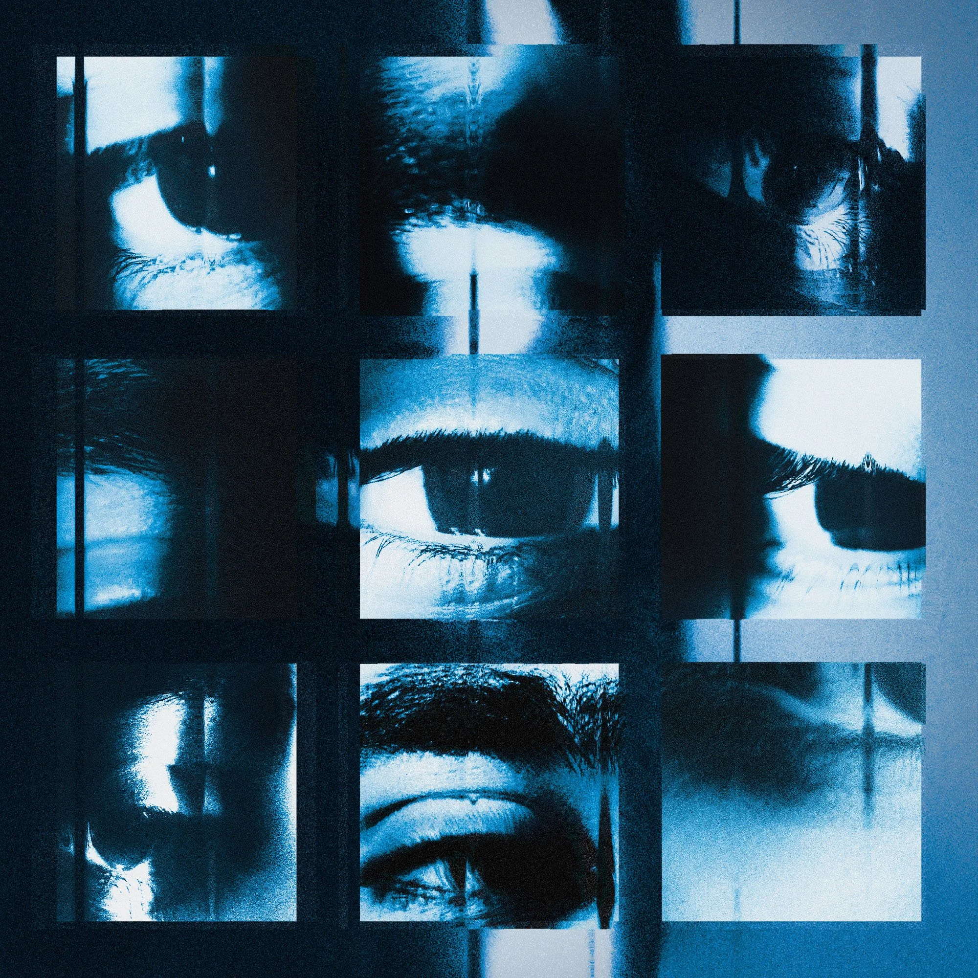
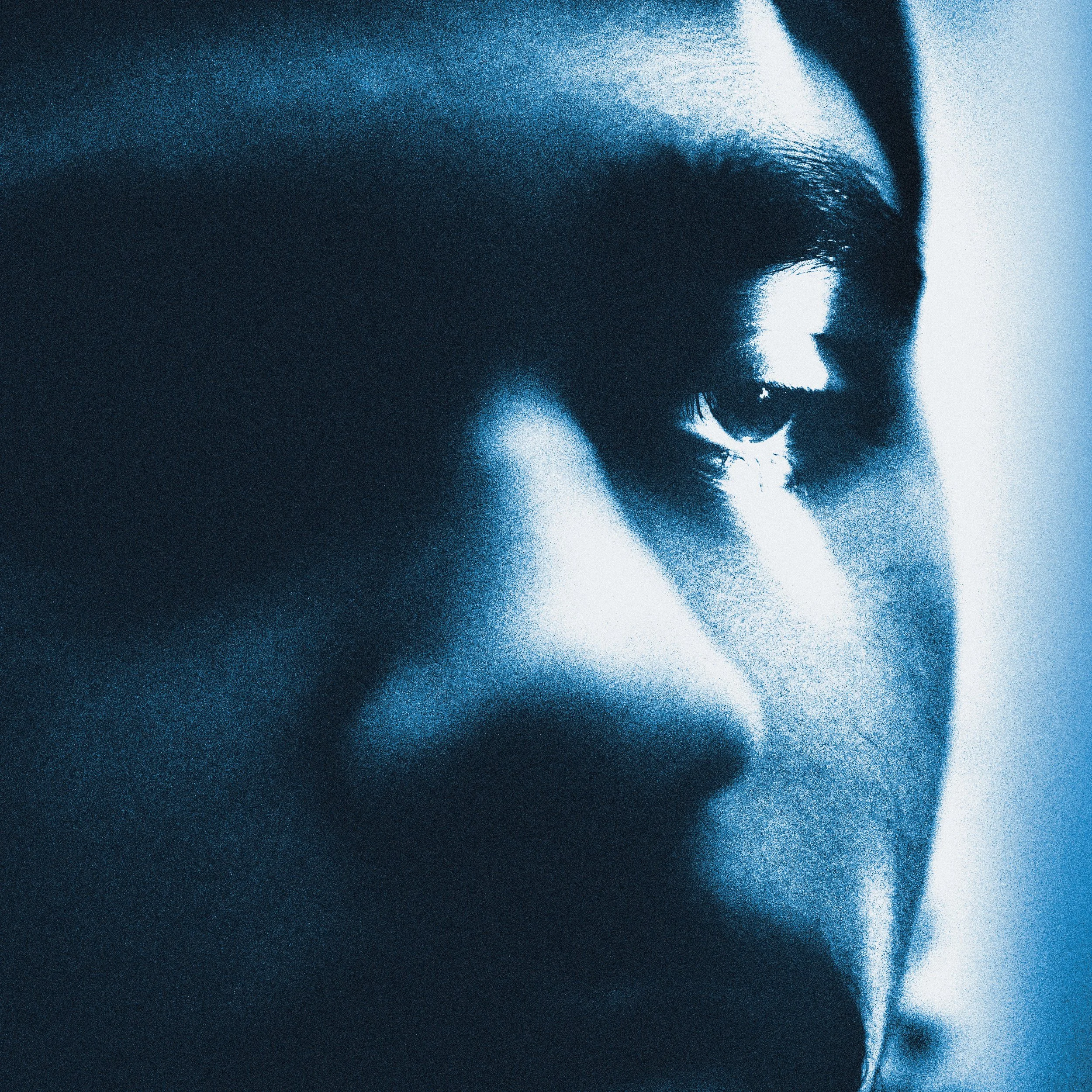
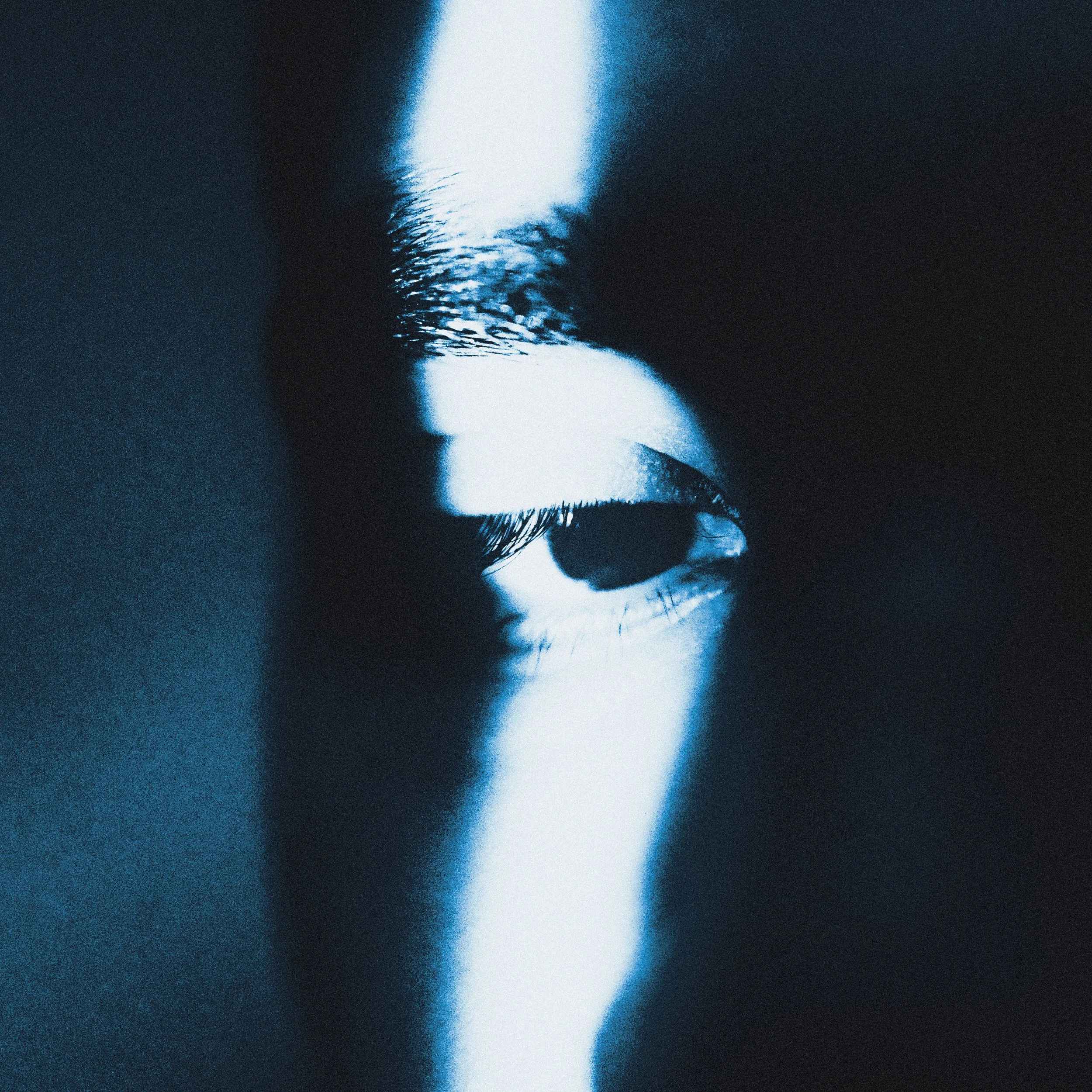
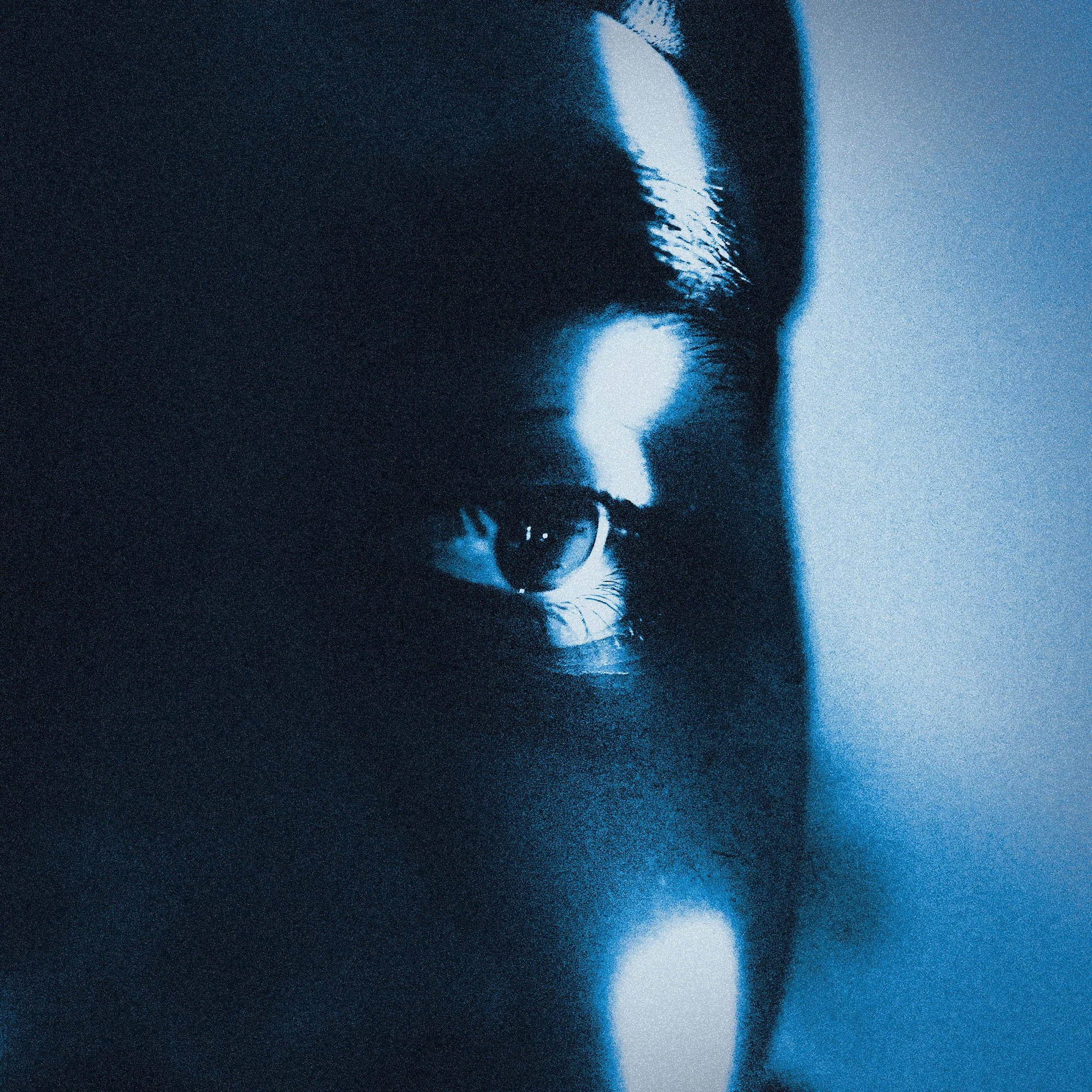
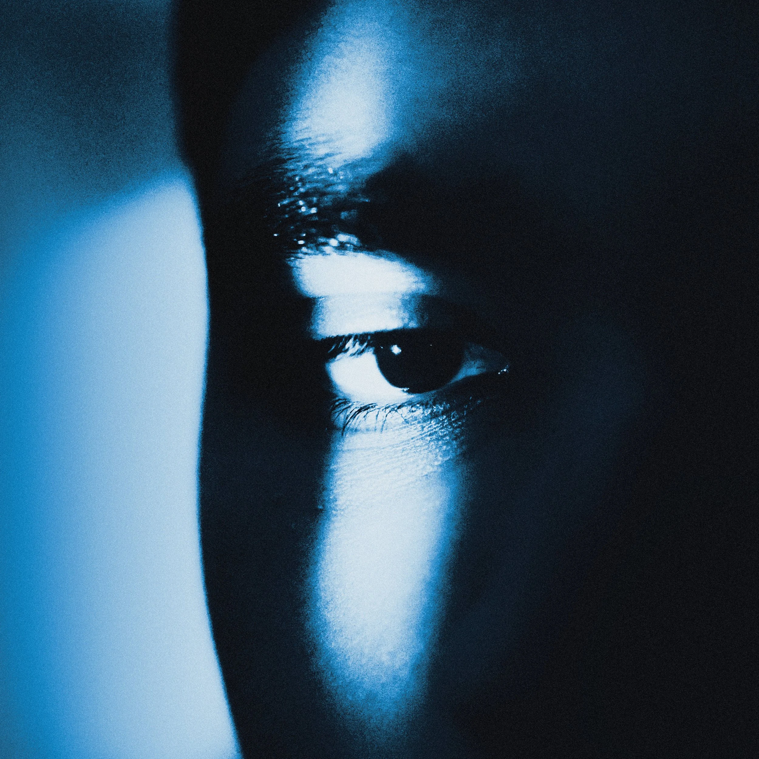
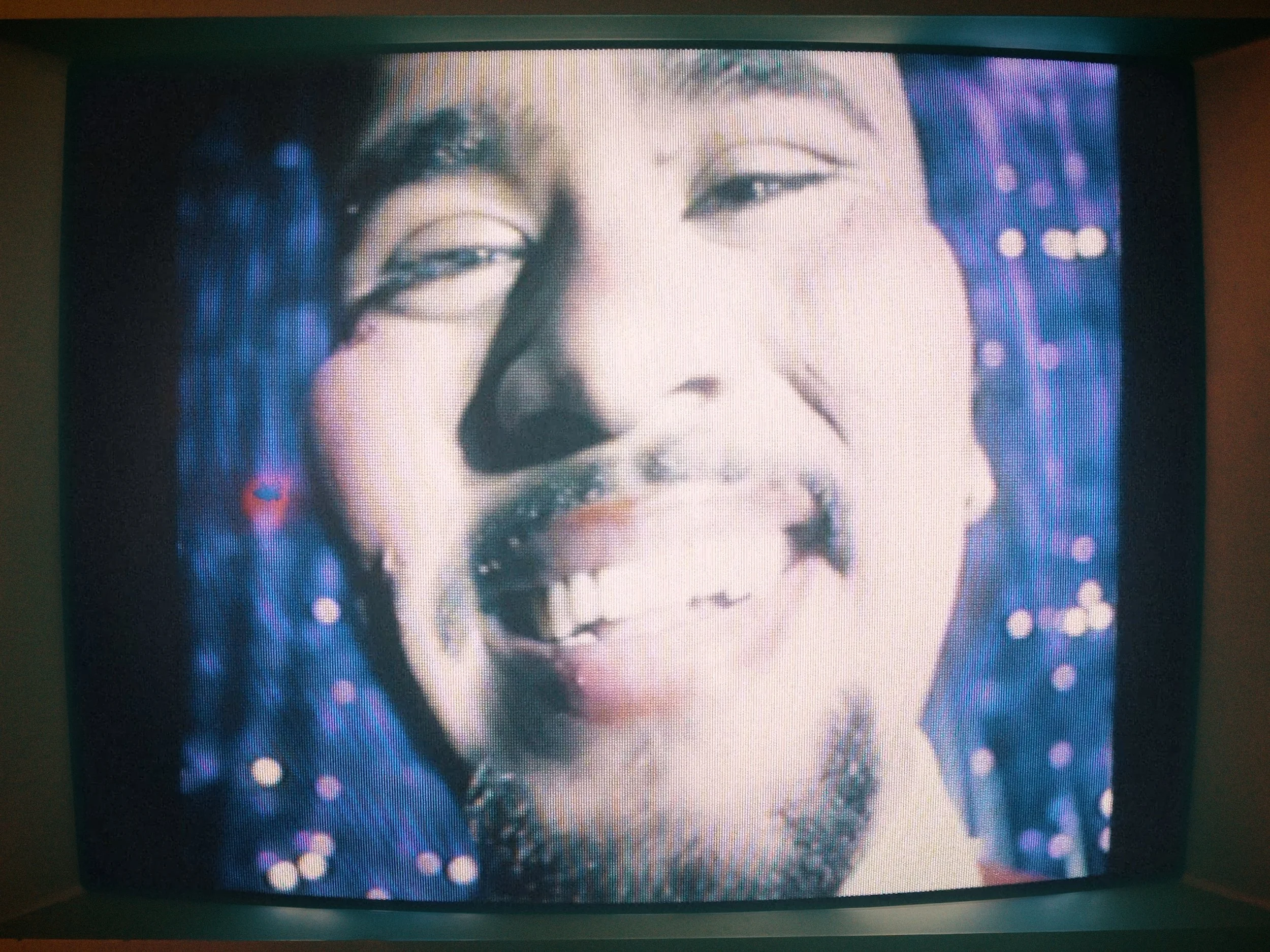
Our initial ideas and concepts were informed by the track itself. A blunt shine, shadowing lyrics of loneliness and inadequacy. Phrases like “The Life is draining from your Eyes” greatly inspired and guided the way we would shoot a cover, as without the consideration, there would be an immediate disconnect between the visual and auditory experience of the song. The connection between the two senses was vital. A person's eyes can say so much about them. Eyes form the basis of human interaction, serving as the primary tool for conveying complex emotion and a banner for how attractive we are deemed to be. We focused on eyes and used light as a metaphor for life, a straightforward concept that could be translated as a photograph. The use of blue light was a creative decision that fell into our lap. January Blues, seasonal mood changes — this was the atmosphere at the time of preparing this campaign.
To keep production costs down, we had to show initiative. Instead of using standard lighting equipment to create the light rays, we used a piece of cardboard with slits created using a key and an iPhone flashlight. This, along with a dome-diffuser camera flash, helped us capture the imagery we envisioned.


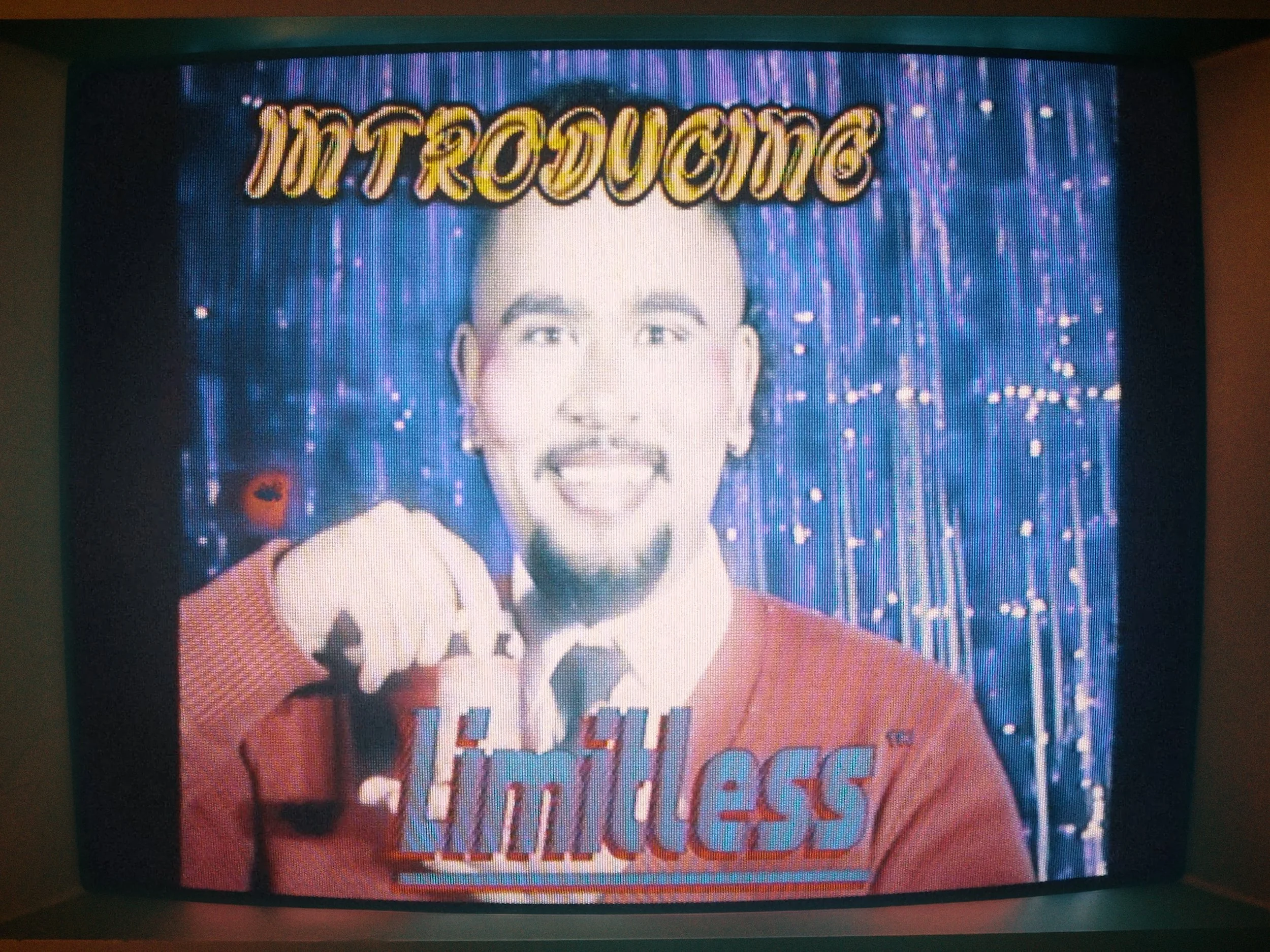
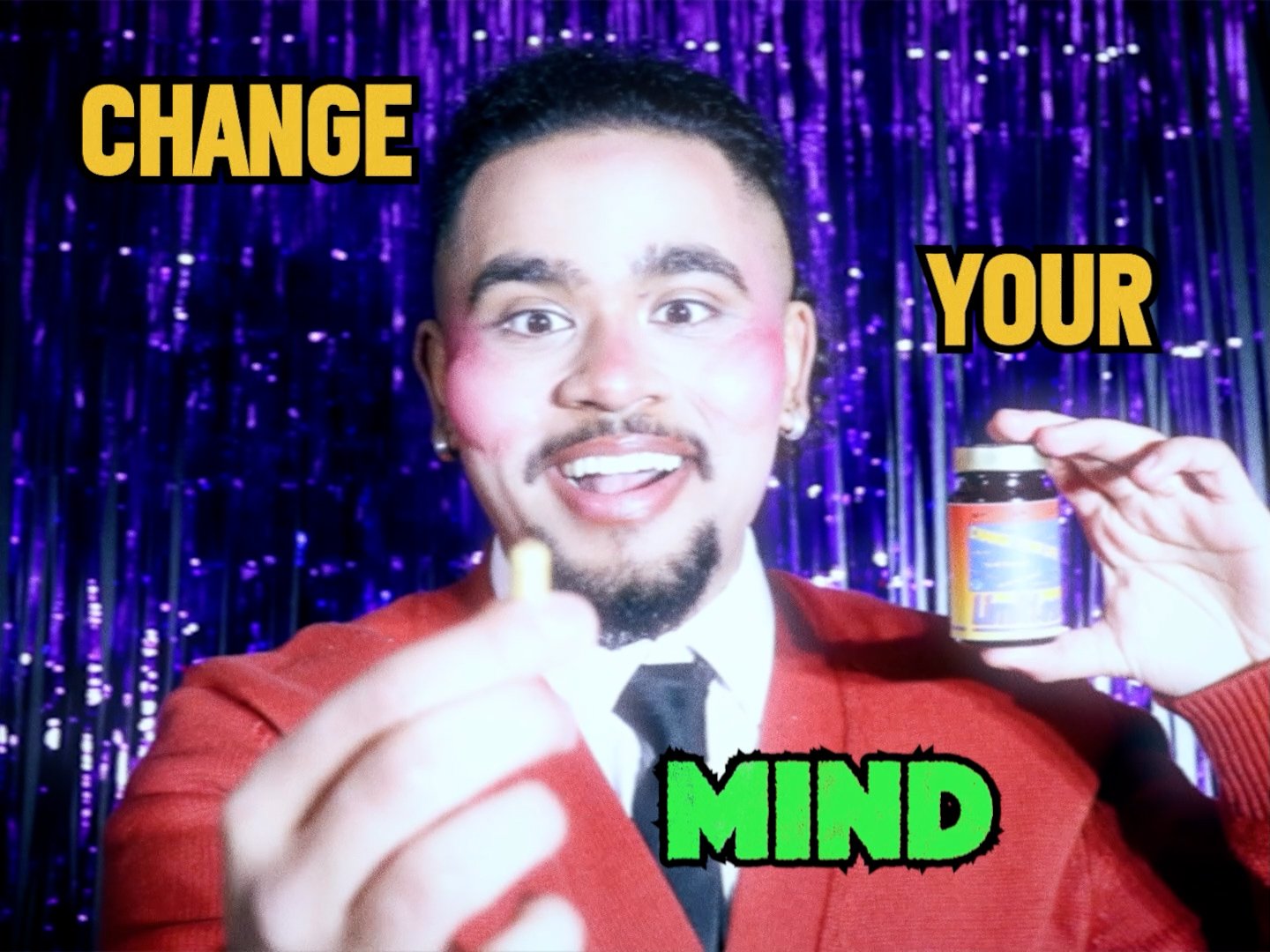
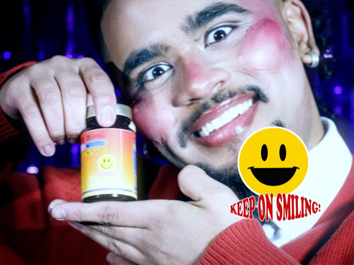
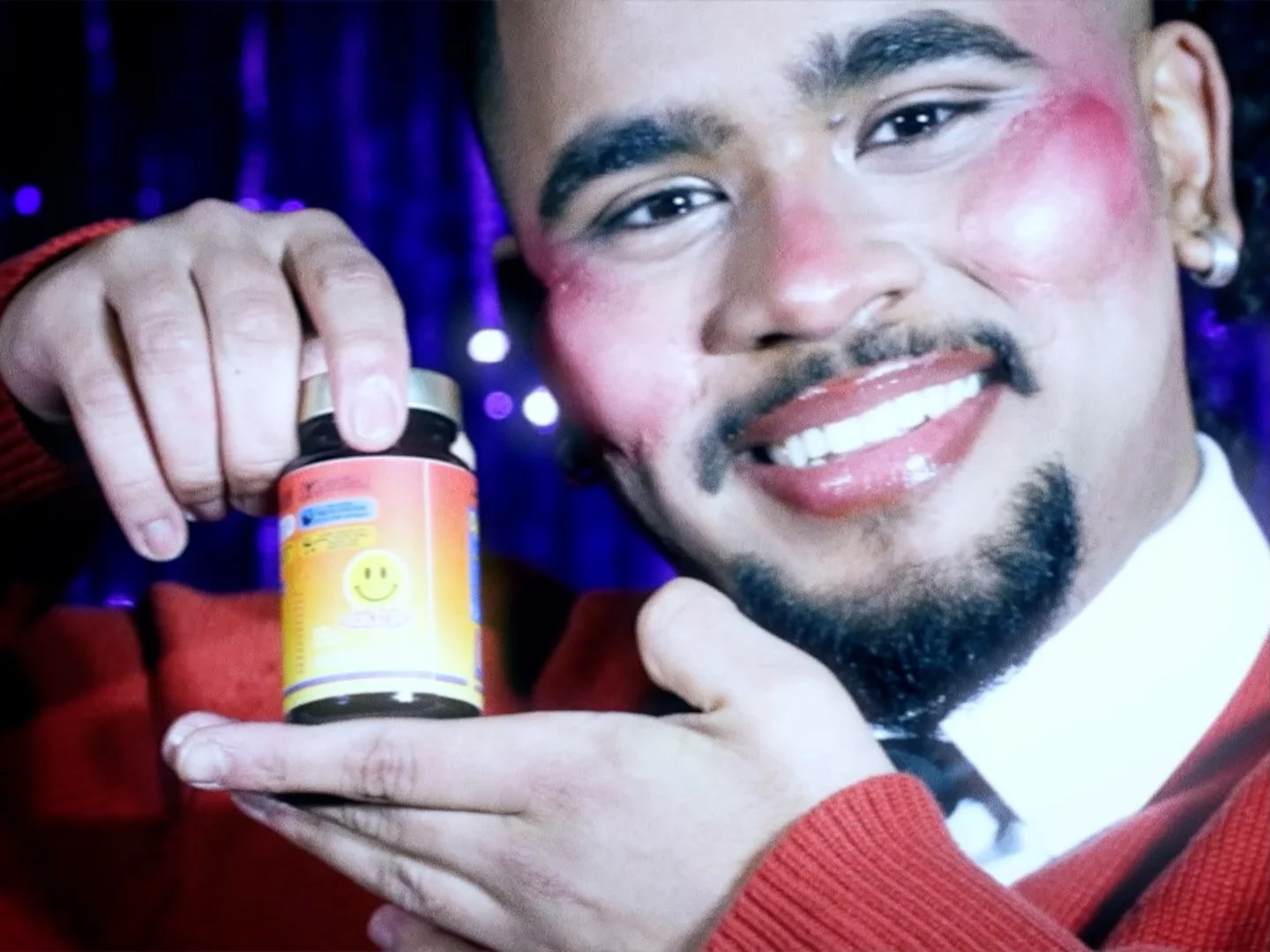
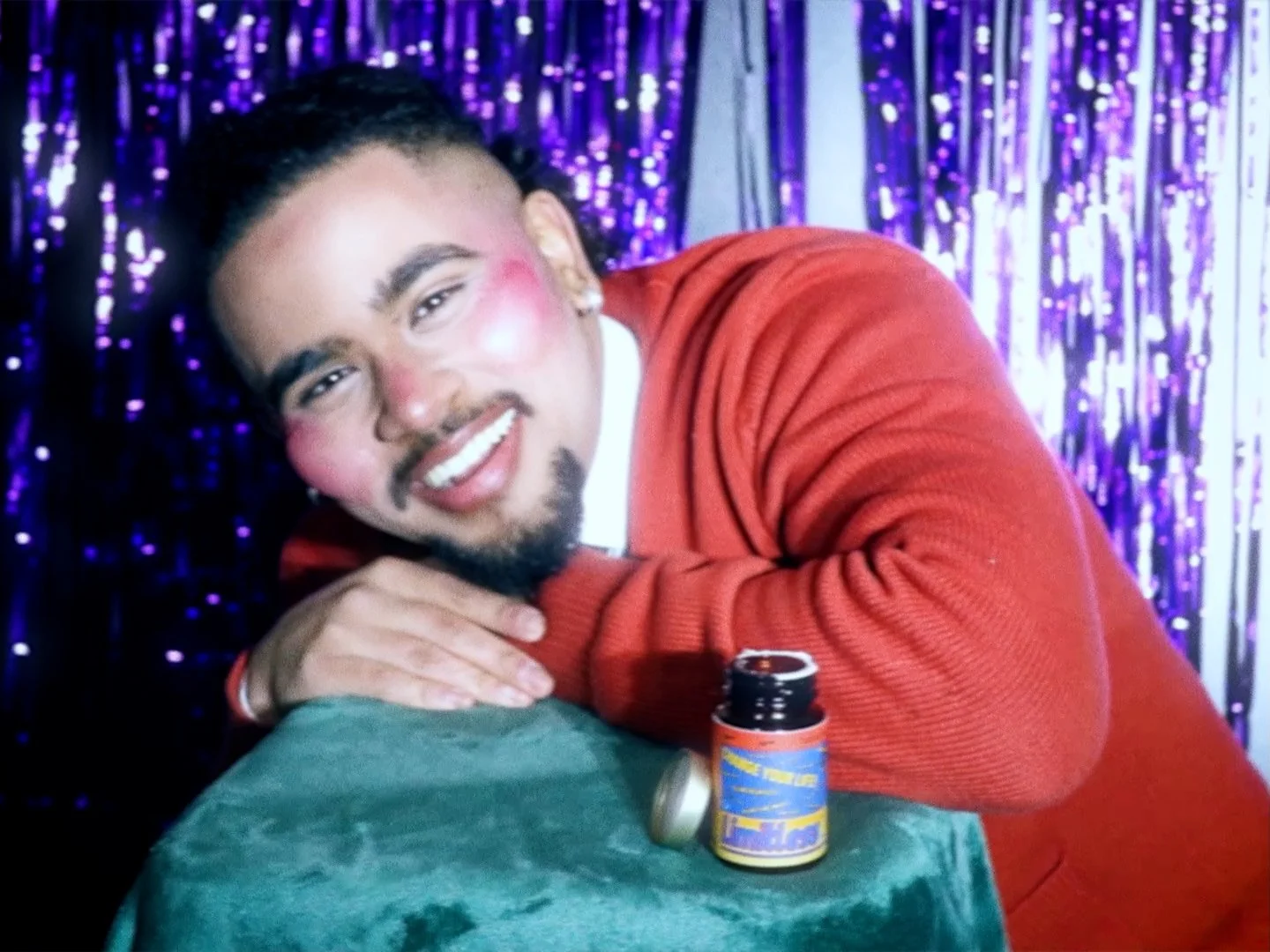
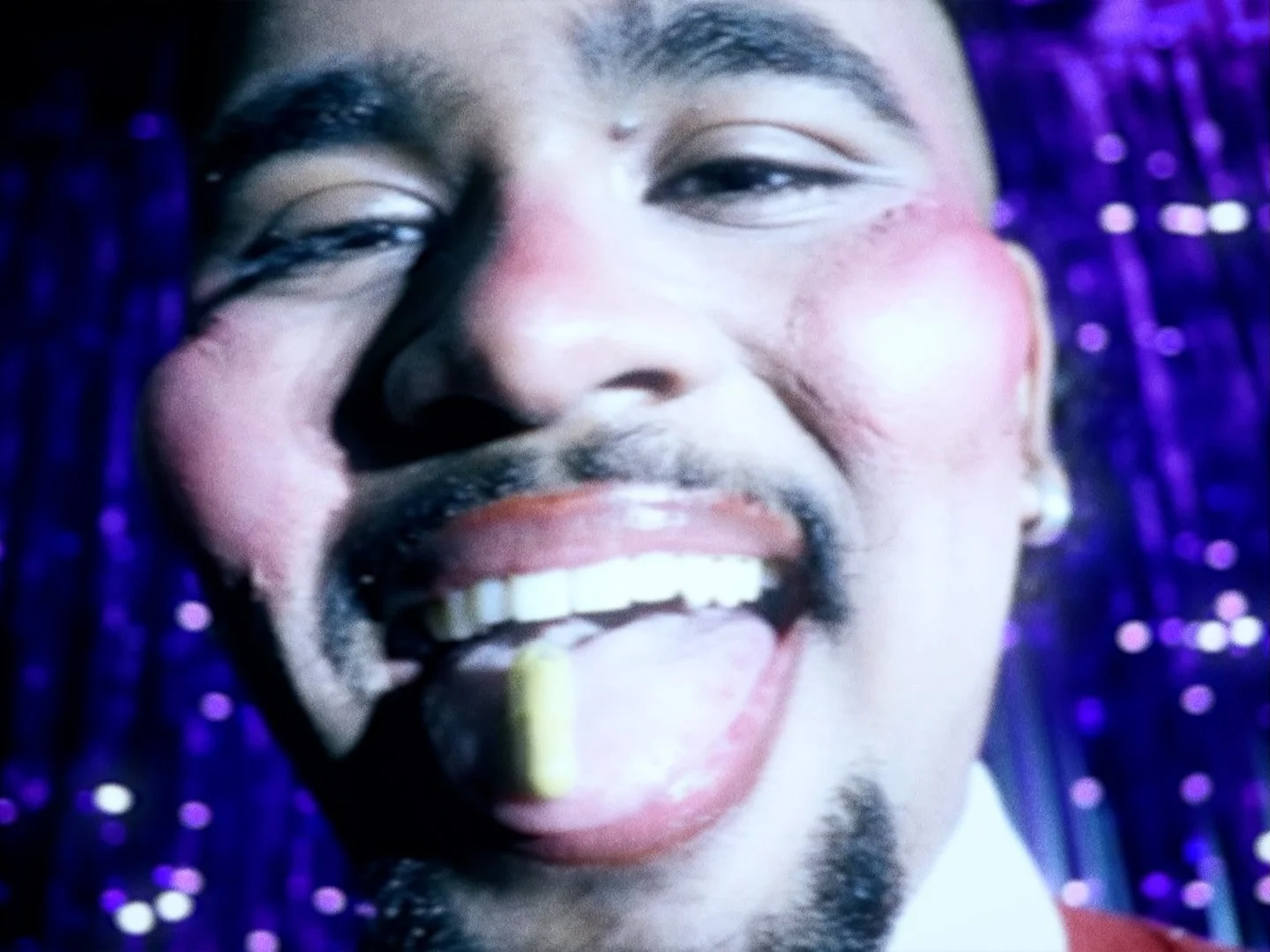
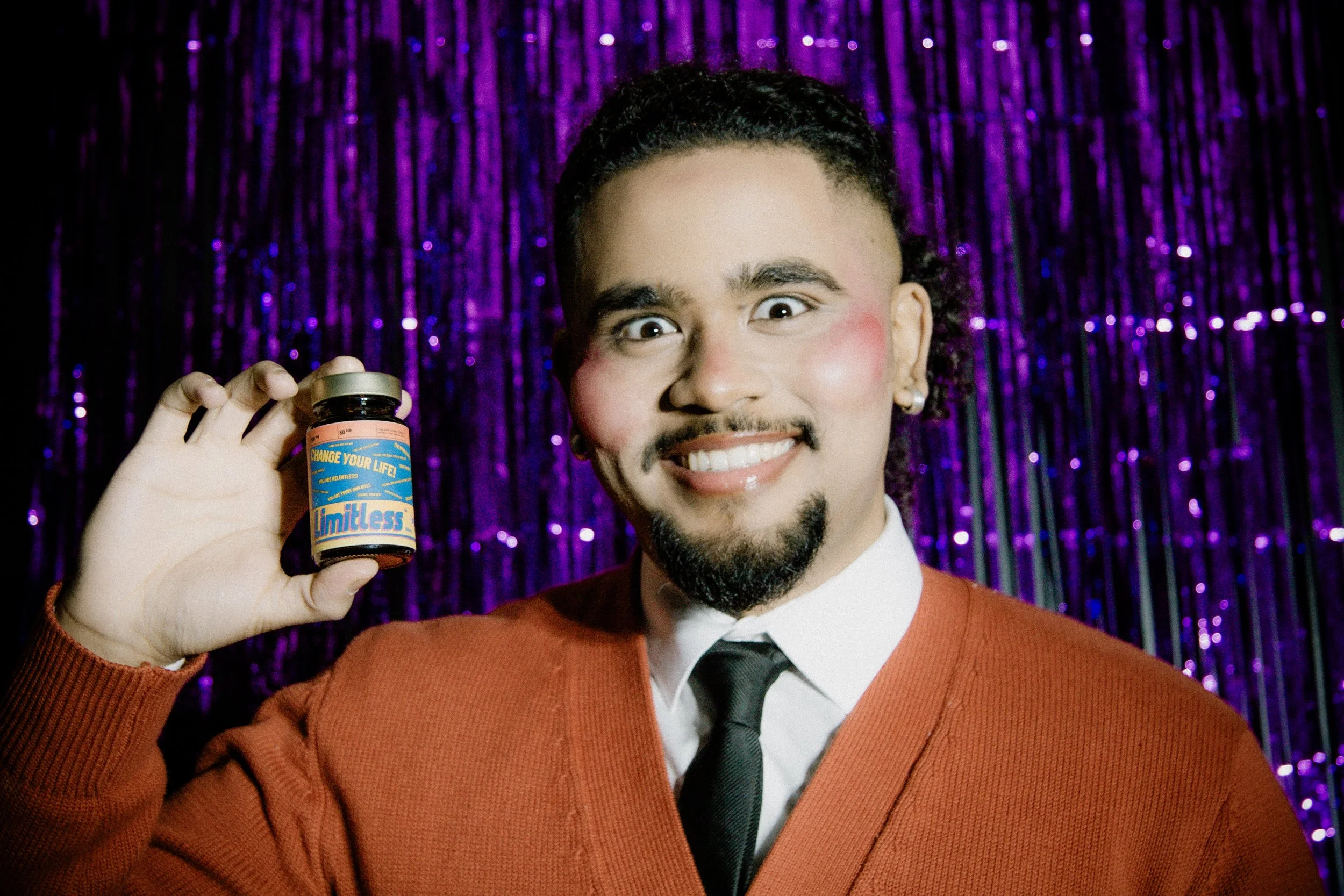
We leveraged the concept of inadequacy as the central theme of the promotional videos we produced. Feeling behind or left out is a natural part of the human journey. The question was how do people deal with it? The four shorts that were filmed follow a man who found his answer in a pill. Eager for success, our character stumbles across an advert that promises relief; relief from overthinking, relief from feeling useless, relief from every emotion that is holding him back. However, we quickly learn that he turns into something that he is not.
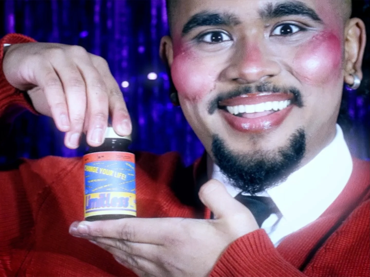
Our campaign takes from films like Limitless (2011) and Black Mirror: Bandersnatch (2018), with the parody advert being a direct call-back to Two Door Cinema Club’s Are We Ready? (Wreck) music video. Managing Partner Nabighah comments, “It is wonderful to see how past pieces of media still influence you to this day. 10 years ago, when 'Are We Ready?' first came out, I was obsessed with how uncomfortable the video made me feel. I was itching to recreate that exact feeling on this project. Just like the reference, the cards used in this parody are lyrics of the song. It also gave us the excuse to use facial prosthetics to exaggerate Balli’s cheekbones, an idea we are all proud of.”
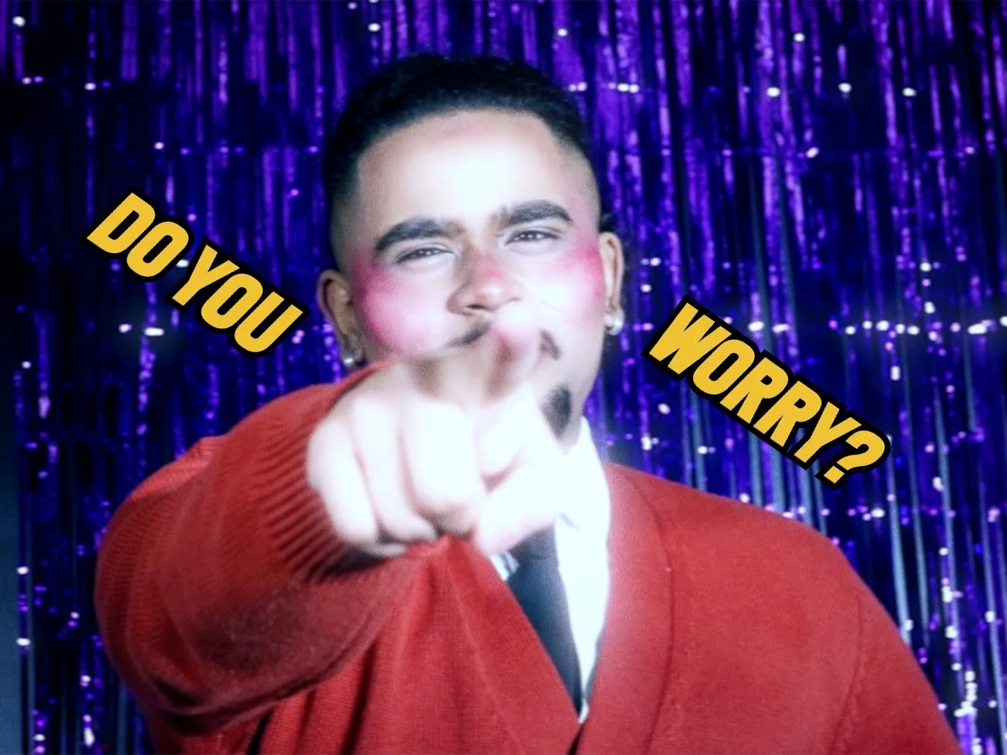

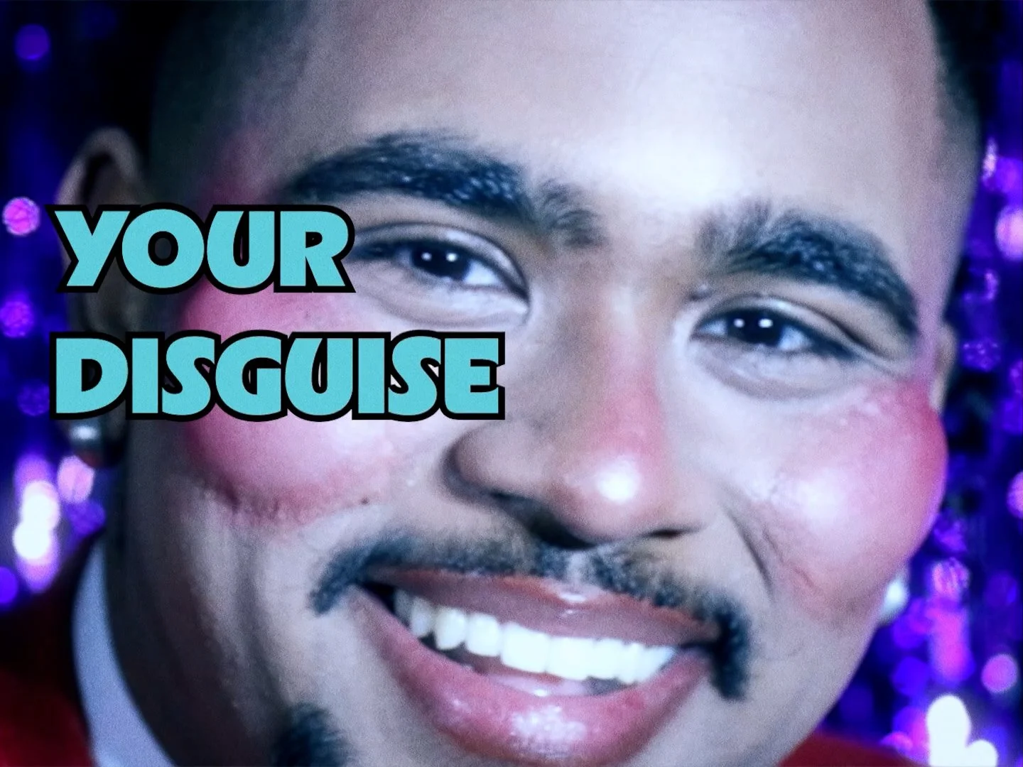
Parody TV Advert, used as a part of the “Do You Worry?” campaign. Inspired by Are We Ready? (Wreck)
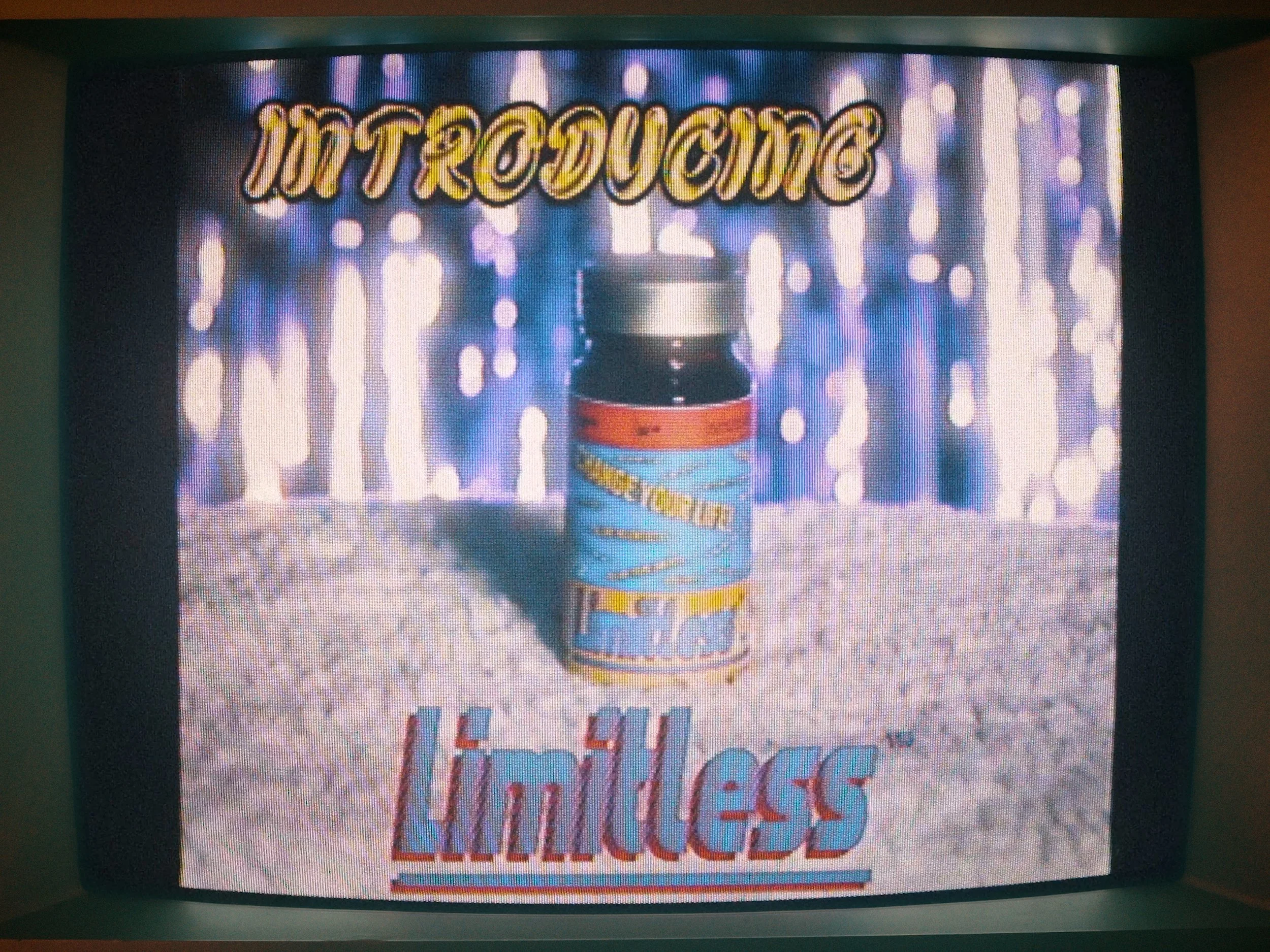
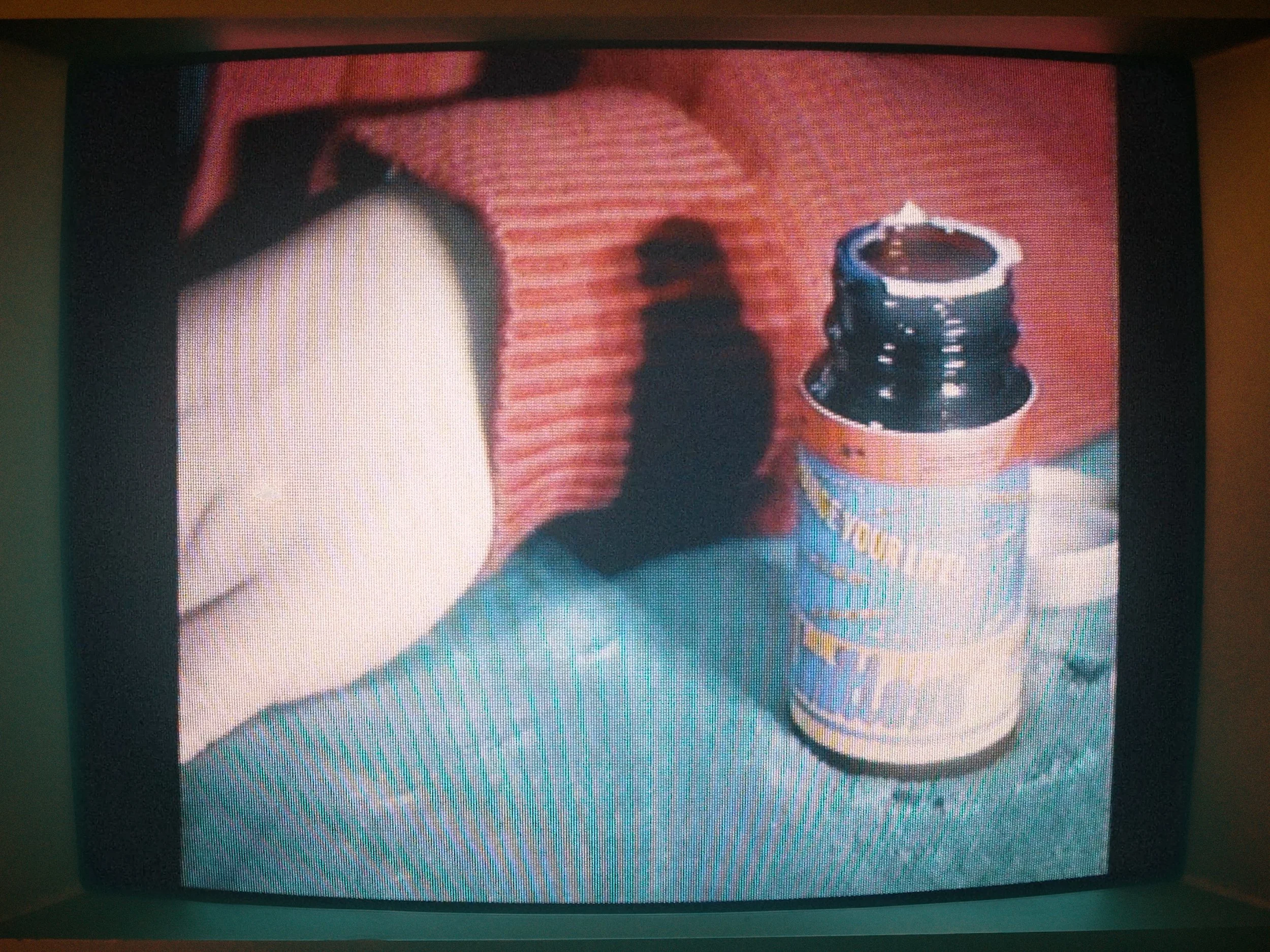
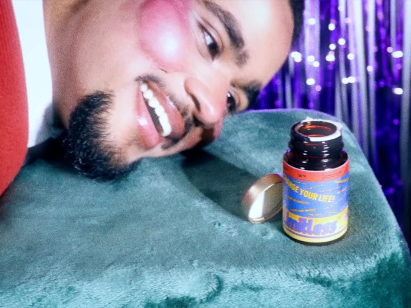
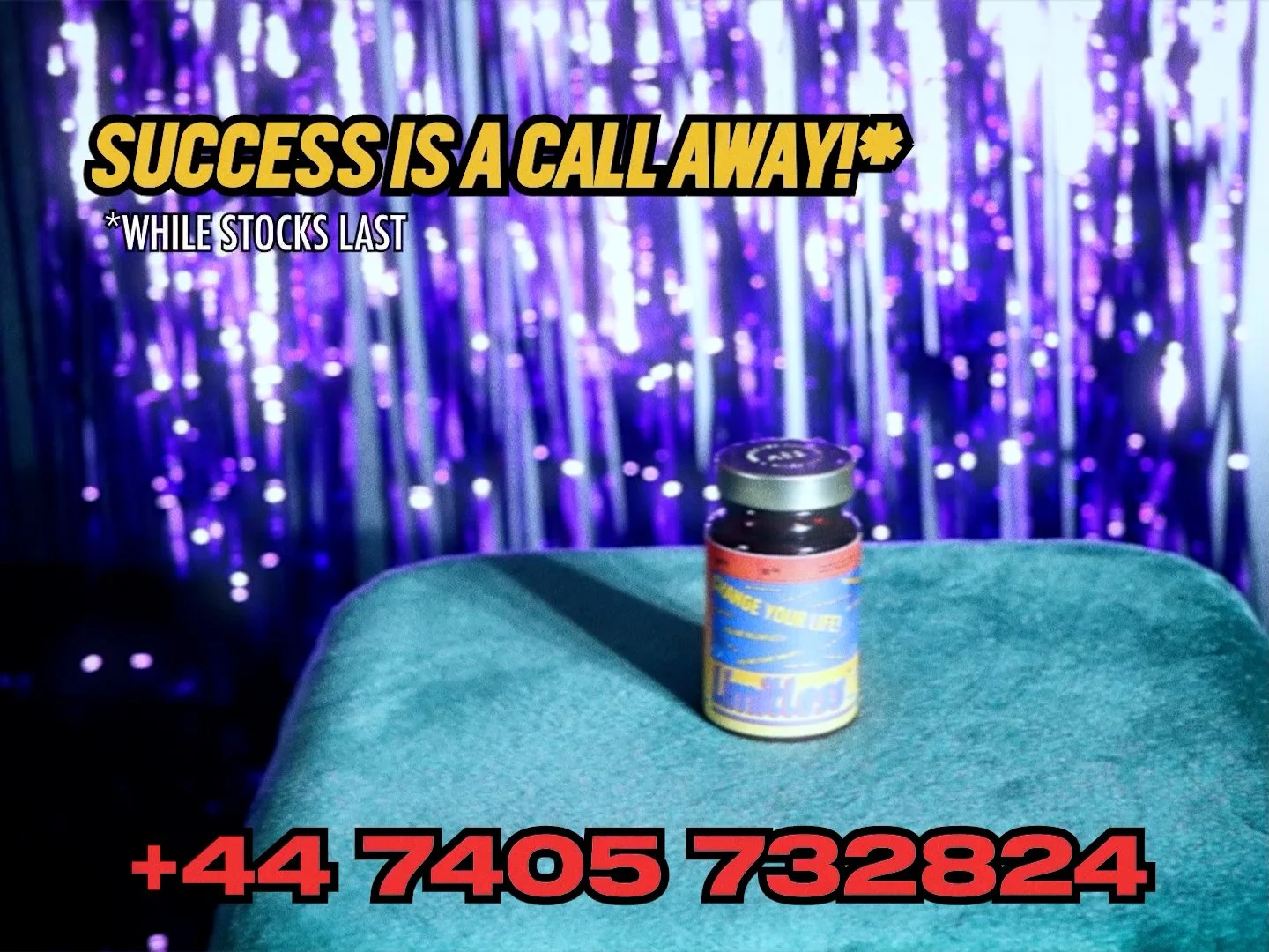
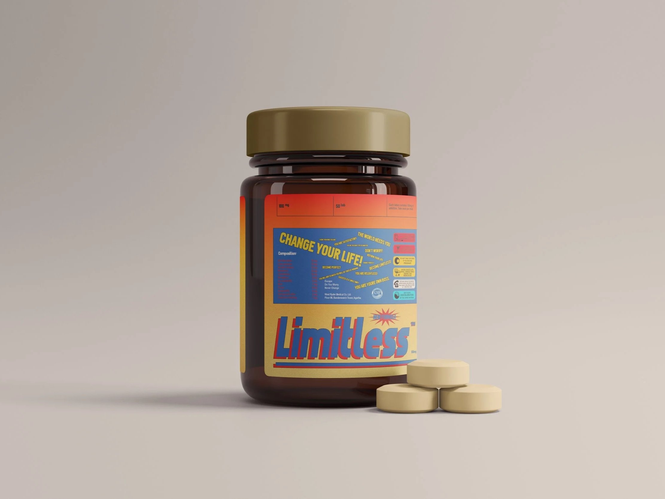
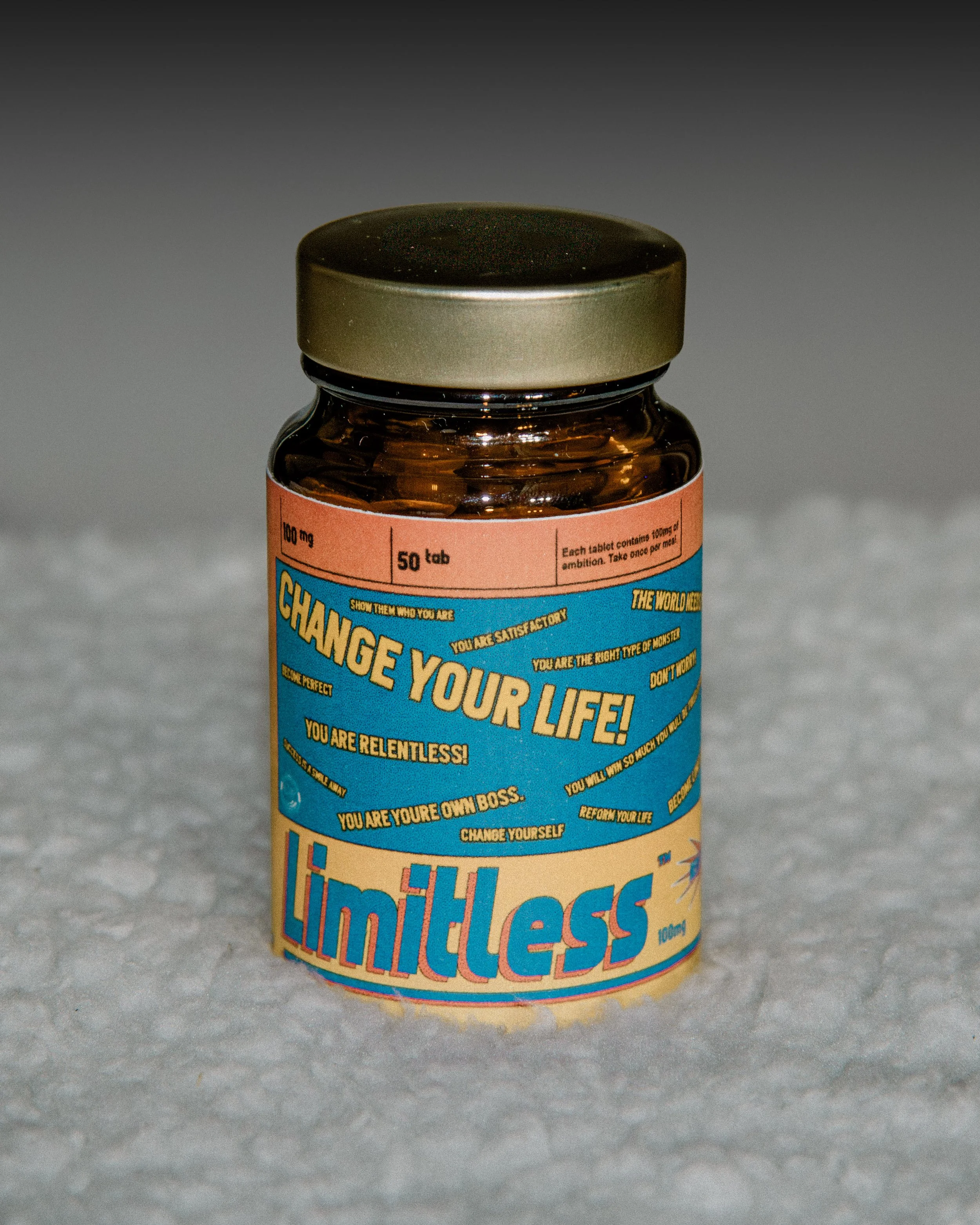
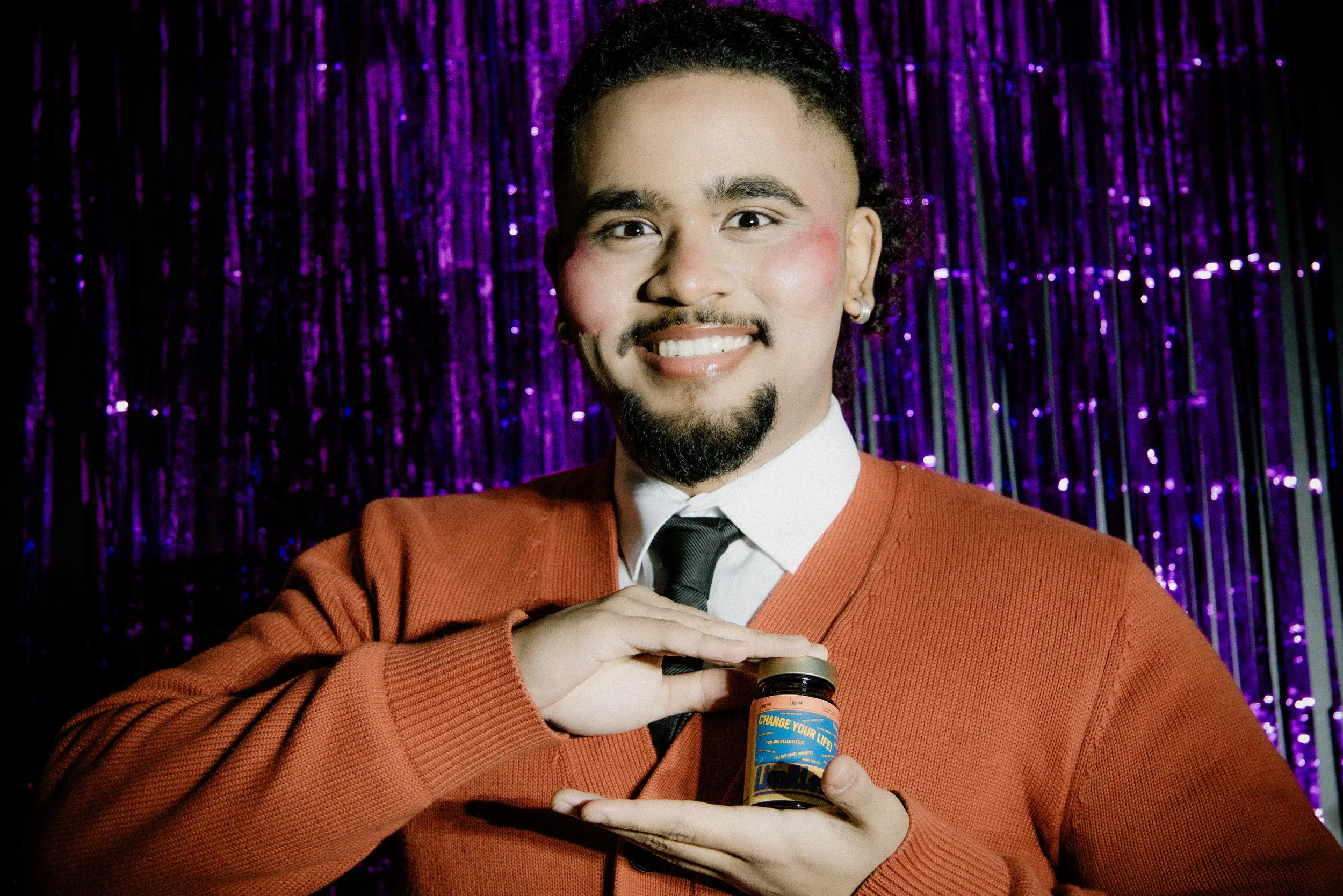
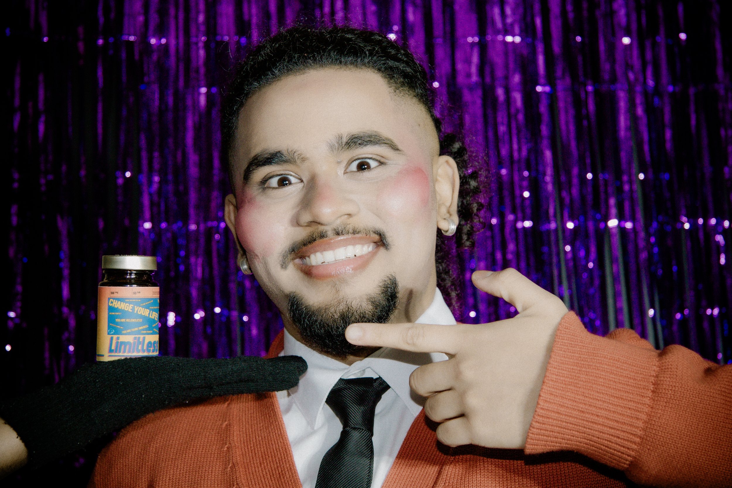
The pill was an important part of our messaging, as it featured in every video we filmed. Designing the packaging was a surprisingly long process, with the first discussions to the final product taking nearly the whole length of this project. Inspired by a mix of both the mainstream and underground drug markets, we also drew elements from old newspaper adverts promoting pyramid schemes - that also happened to be where we derived our orange, yellow, and blue colour palette from. “Limitless” embodies the modern way of thinking. Do you want to lose weight and not exercise? Take a drug. Do you want to think outside the box? Take a drug. Do you want to be successful? Take “Limitless”. These drugs are barely legal - some of them actually are illegal to use - but are so normalised in our culture. It should be good to mock things sometimes.

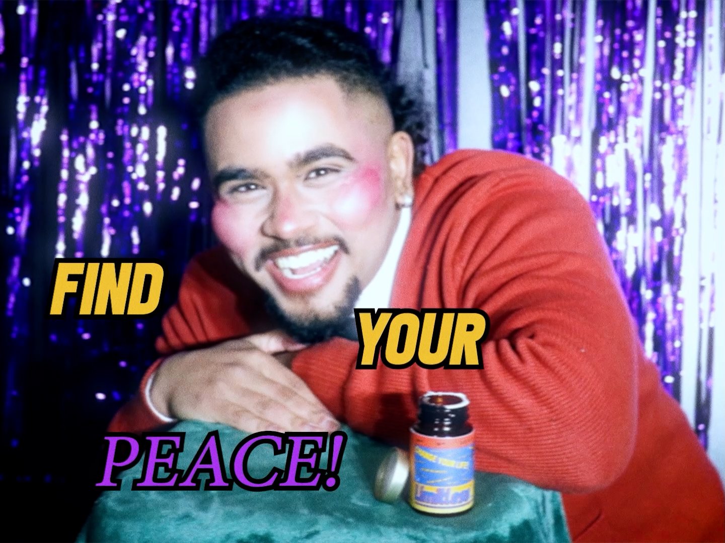
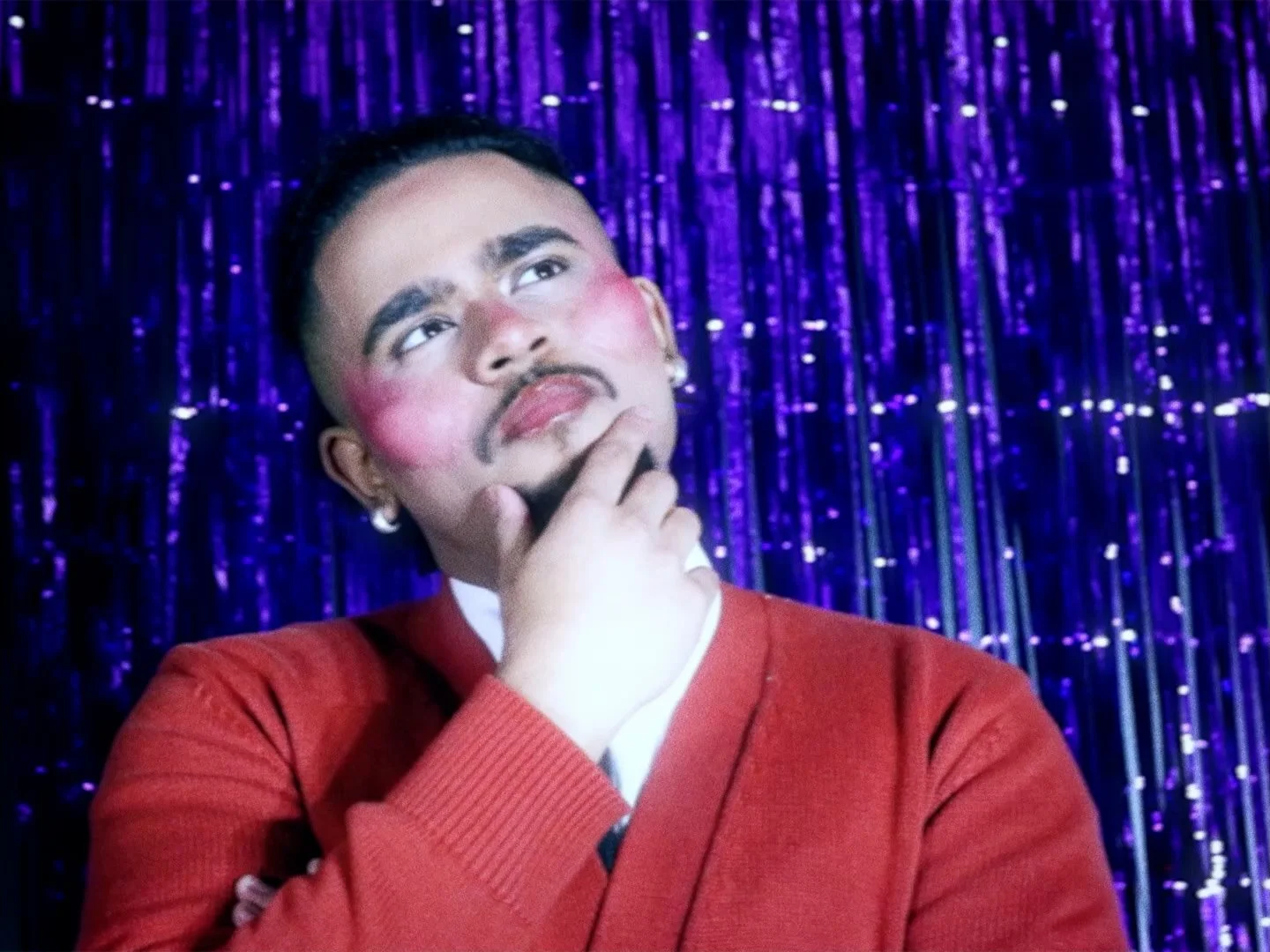
The ideation process of our four promotional videos began by asking Balli Ivory what “Do You Worry?” meant to him. He explained to us the thematic focus of a self-imposed facade, stemming from mimicking others as a clutch towards success. Once this was understood, we focused on what the song meant to us. Marketing Partner Ihsan U comments, “While listening on repeat, I closed my eyes and reflected on my own life, finding a connection between “Do You Worry?” and my own struggle with imposter syndrome alongside “masking” within social settings. The line “Oh I worry how, You’ll find your peace, In this house” stuck with me, especially “Find Your Peace”. I dwindled on the topic of conformity. Alongside this, I resonated deeply with the popular saying “Comparison is the thief of joy”. Combined, these pieces of information acted as the foundation for my concept.”
Our objective was to tell the story of a man who was shown a surefire method of success, or so he believed. As he pursues this vice, he loses his identity. Becoming just a poor imitation of what he was supposed to be. For our story, we thought about how we could visually communicate this transformation through a physical change. Drawing from the Uncanny Valley phenomenon, we thought of a visual transformation that was almost human, but lacked an unexplainable quality. Alongside this, Ihsan U led the decision to show a loss of self through set design. The pieces in a person’s home tell a story, a physical collection of their character, the outlets of their creativity.
All four parts of this story are set in the same space. The first part showcases the space full of warm lights, art pieces, and greenery. During part one, our character (played by Balli Ivory) watches an advert for "Limitless" pills that present his ideal self. Within the ad, we used the on-screen text to include phrases that matched the lyrics as a visually creative way to focus on the song. As part one continues, there is a gradual decrease in the warmth of the colours, showcasing our character's change in perception as he watches the ad.
Part two shows a stark difference in set design and colour, with all items in this once full room are now gone, excluding the CRT TV in which the ad is playing alongside a table full of Limitless packaging. Our character has taken the “Limitless” pills, and this sudden emptiness of the environment acts as another portrayal of his loss of self alongside his physical change. Part three shows our character’s reality breaking, his prosthetics are ripped through excessive scratching; it’s clear that this false success had caused only harm. To close the story, we used the fourth and final video to show our character rebuilding his home piece by piece, bringing back the original warmth in his environment, finally turning off the TV that presented this inauthentic reality, and finding his peace.
What made this project particularly interesting was the constant tension between constraint and ambition. With limited resources, every decision had to justify itself. There was no room for excess or unnecessary complexity; each element had to serve the concept. The limitations sharpened our thinking. When budgets are large, it is easy to solve problems with equipment or scale. When they are not, the solution has to come from imagination. That mindset ultimately shaped the character of the entire campaign. Another thing became clear throughout production was how important cohesion is when working across multiple formats. The still imagery, parody advert, and campaign videos all needed to feel like parts of the same world. Recurring motifs like the pill, the blue light, and the focus on the eyes allowed the different modules to reinforce each other rather than compete for attention.
In the end, the project became less about promoting a single track and more about building an atmosphere around it. The visuals gave form to emotions that are already present in the music. That alignment between concept and execution is what made the campaign feel authentic. When the visuals and the music speak the same language, the promotion stops feeling like promotion, and becomes a part of the story itself.
The creative team behind this project included Nabighah, who led photography and design, assisted by Max P. Ihsan U led prosthetics, video production, and post-production. We also extend our gratitude to; Elle and Avni who aided in makeup, Malachi and Avni who were our production assistants, and Liv who served as location scout. A special thank you goes to Arjun Balli, who coloured & edited the campaign videos and lent his voice for the advert voiceover.