
Heritage open days
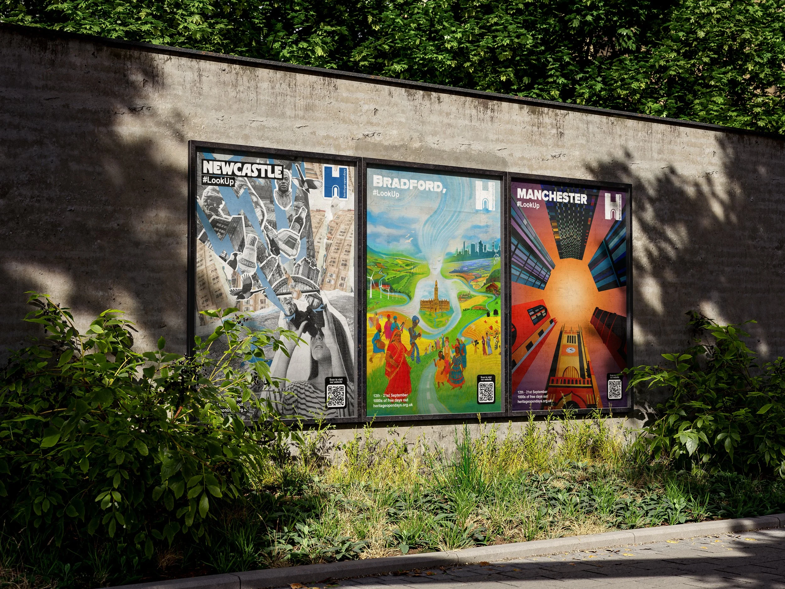
Left to right, posters for Newcastle, Bradford & Manchester
Established in 1994, Heritage Open Days (HOD) is England's contribution to the European Heritage Days and has since grown into the country's largest community heritage festival. The festival commences every September, originally launching with 701 events, now hosting three million visitors each year. In 2025 it plans to host 6000+ free events, supported through organisations and local volunteers. HOD is managed by the National Trust, with over a decade's support from organisations such as Peoples Postcode Lottery and many more, both local and national.
As part of the #LookUp Campaign, our aim was to create a visual spark for locals, through designs representing three northern powerhouses; Bradford, Manchester & Newcastle. We wanted to shine light on what lies in the hearts of the local people while aligning with this year's theme for HOD, Architecture. We believe each city resembles a book, its chapters written by the residents’ lives. No two share the same story or, more fittingly, the same cover. This idea integrated itself as a core belief and driving point during our process.
We collated several online historical and public sources, with a particular focus on each city's key structures and buildings, forming individual moodboards. However this was not enough; our goal was to view each city from the eyes of a local, and what better way than to ask residents themselves? To achieve this we formed focus groups of residents within our target demographic from Bradford, Manchester & Newcastle, respectively. These sessions significantly steered our design approach. Each interviewees' response illustrated the iconic and personal pieces of their city.


As of 2025, Bradford has been designated the UK’s City Of Culture, likely accredited due to its rich cultural diversity and equally rich history of artistic and industrial innovations. This title and its importance to the city had been highlighted through both initial moodboards and focus groups, becoming a clear point to be visually represented. Our aim for the portrayal of the city was directed through interviewees descriptive words such as communal, vibrant, full of life and serene. Overall Bradford presented a picturesque and vivid atmosphere, perhaps flamboyant. Furthering this naturalistic imagery we wanted to honour the art style of the late David Hockney, iconic Bradford born artist famously known for his colourful pop art style. This city breathed life into its residents, and we aimed to portray this. We present Bradford as a physical being, centred and watching peacefully. The figure cradles the City Hall lying within the central area of the city. Bradford’s City Hall was spotlighted as the core architectural piece due to its visual beauty and personal sentiment to locals. The centrepiece spews life into the foreground of the design, showcasing characters of different backgrounds celebrating in union as to embrace Bradford as the City of Culture.
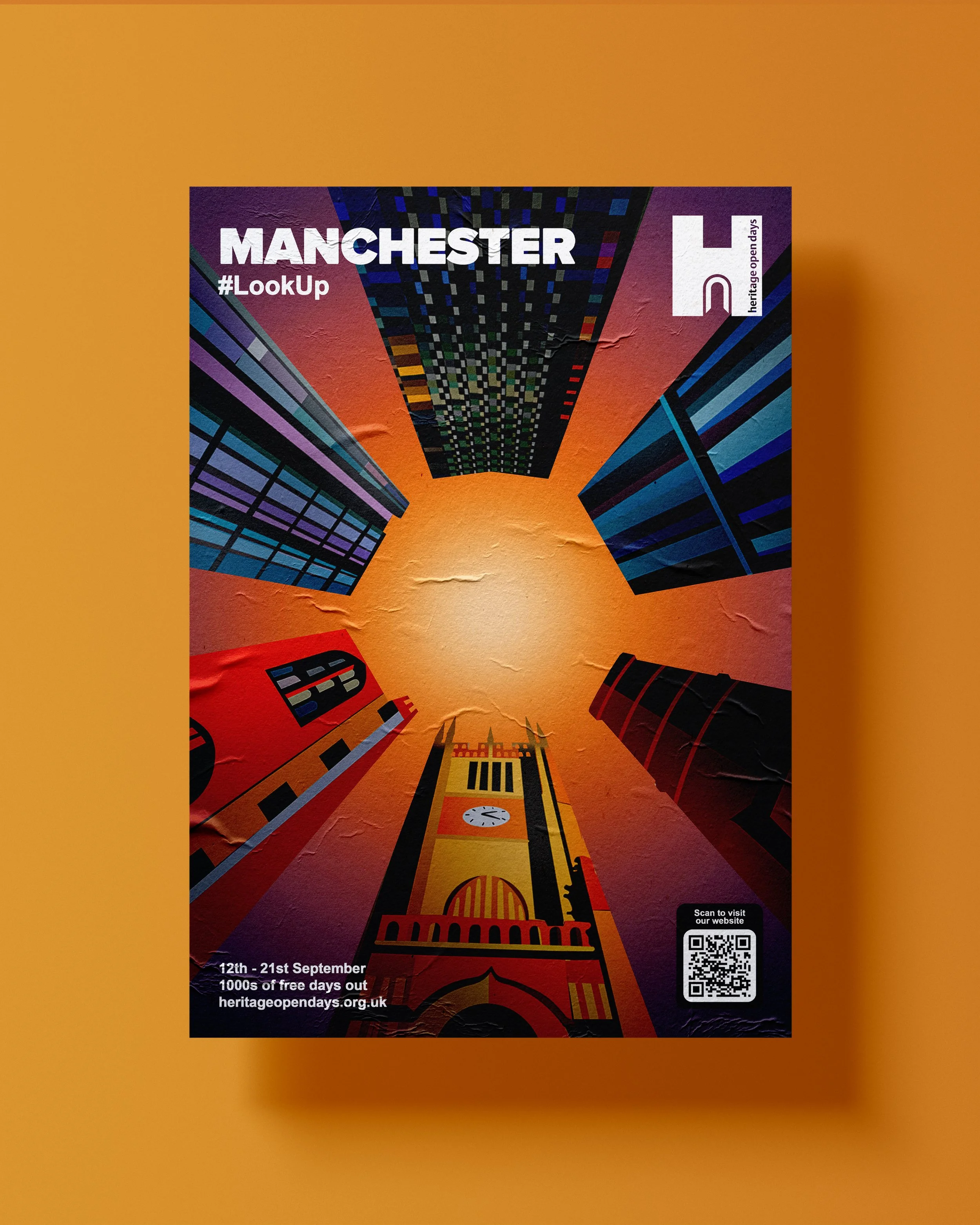
Manchester is known as the Capital of The North, home to some of the UK’s largest skyscrapers while simultaneously promoting its more humble, historic buildings. This creates an equal balance between a city that looks towards the future whilst remembering its roots as the industrial city of “Cottonopolis”. Our focus groups highlighted a deep symbolism embedded within the city, being that of the worker bee. This symbolism is strongly embraced, physically seen within buildings of the city of Manchester and sold within merchandise. The Worker Bee represents Mancunians, a communal workforce all sharing the same goal. To further advance the city, while maintaining the hive. However, the prominence of the Worker Bee symbol steered us away from directly including the bee as a visual aspect. We wanted our design to stand out, highlighting the chips that are often overlooked. Manchester felt modern to us, but not futuristic heavily due to its appreciation of the things it held in the past. We opted for a subtle approach, using the shape of a honeycomb wedged within the city sky. Each side of the honeycomb was outlined using an iconic building of Manchester; identified and chosen through our research and focus groups. The top half of the honeycomb is outlined by Colliers Yard, Deansgate Tower and Beetham Tower, from left to right respectively. The bottom buildings showcase Manchester Cathedral, John Rylands Library and the Old Mill. Buildings at the top show the way forward and the future, whilst buildings at the bottom showcase and honour the past.
Lying at the northernmost region of England, Newcastle is famed for its industrial heritage and numerous historical landmarks throughout the city. A key landmark we highlighted was the River Tyne, connecting several iconic structures together such as Tyne Bridge, The Glasshouse, The Blacksmith Needle and The Millennium Bridge. Additionally, the river hosts Newcastle’s vibrant nightlife, another key feature representative of the city. This marked the River Tyne as a particularly strong feature to include. However, we did not want to overshadow the remaining cluster of items representing Newcastle. Our research showed each monument, building or structure held equal importance in its definitive strength. We decided to tie this knowledge into the concept of the #LookUp Campaign, creating a collage of iconic references that held equal cultural relevance to the city presented as a visual cluster towards the top half of the design. The references included buildings such as Grey Street, The Quayside, Tyne Bridge, Glasshouse, Blacksmiths Needle, Grainger Market, Angel Of The North, St. James Park, St. Anne’s Church, The Castle & Newcastle City Library. Additionally we included further miscellaneous icons representative of Newcastle such as; the Magpie, the Greggs Sausage Roll, Martin Luther King Jr, the River God Tyne, and Newcastle Brown Ale.
The creative team behind this project was led by Lead Designer Nabighah, Illustrated by Serrell Tafari, and researched by Ihsan Uddin. We also extend our gratitude to Joseph Gray of Beatfreeks Consulting, who served as our point of contact and project manager for this brief.